Hampton VA.
Over the course of my time with Hampton, I’ve been diligently working on reinventing the image the city and challenge the idea of what government looks like.
One Hampton
I created this animation for Hampton’s Annual State of the City event. It served as a recap of how the city banded together during the pandemic and to introduce the new Hampton, VA brand.





















Hampton VA Brand
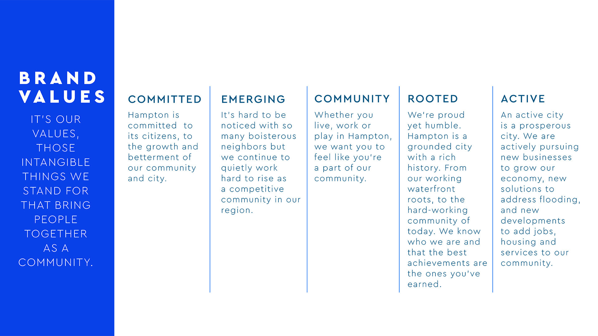
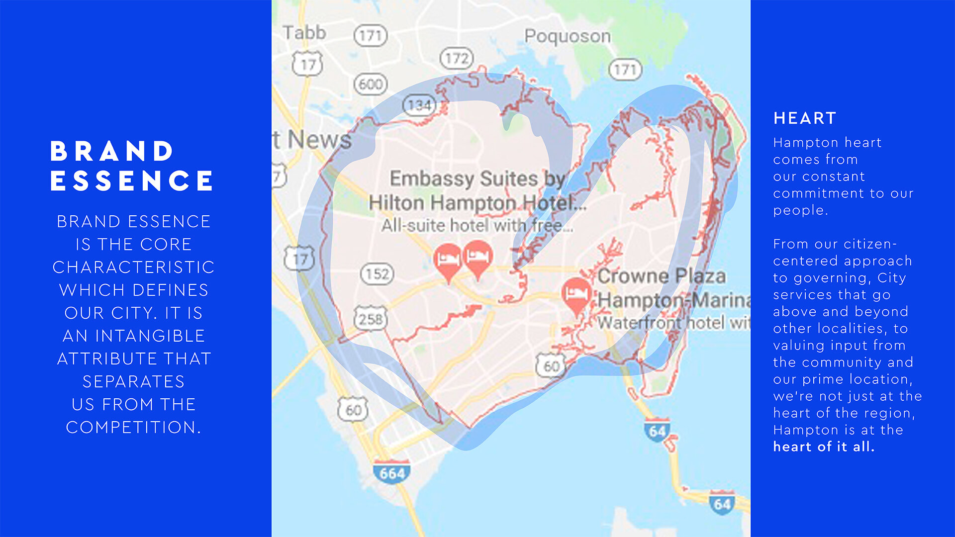
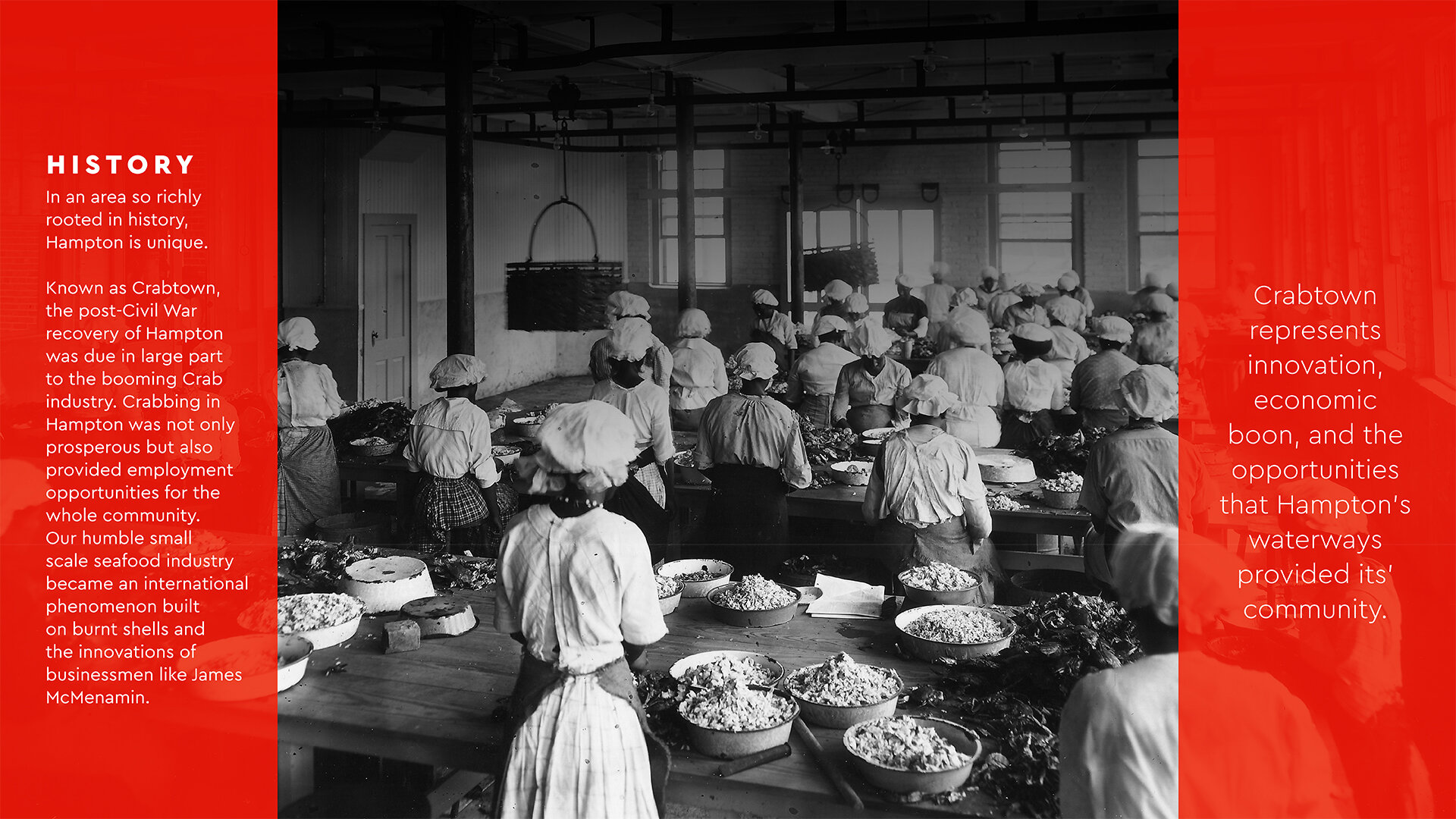
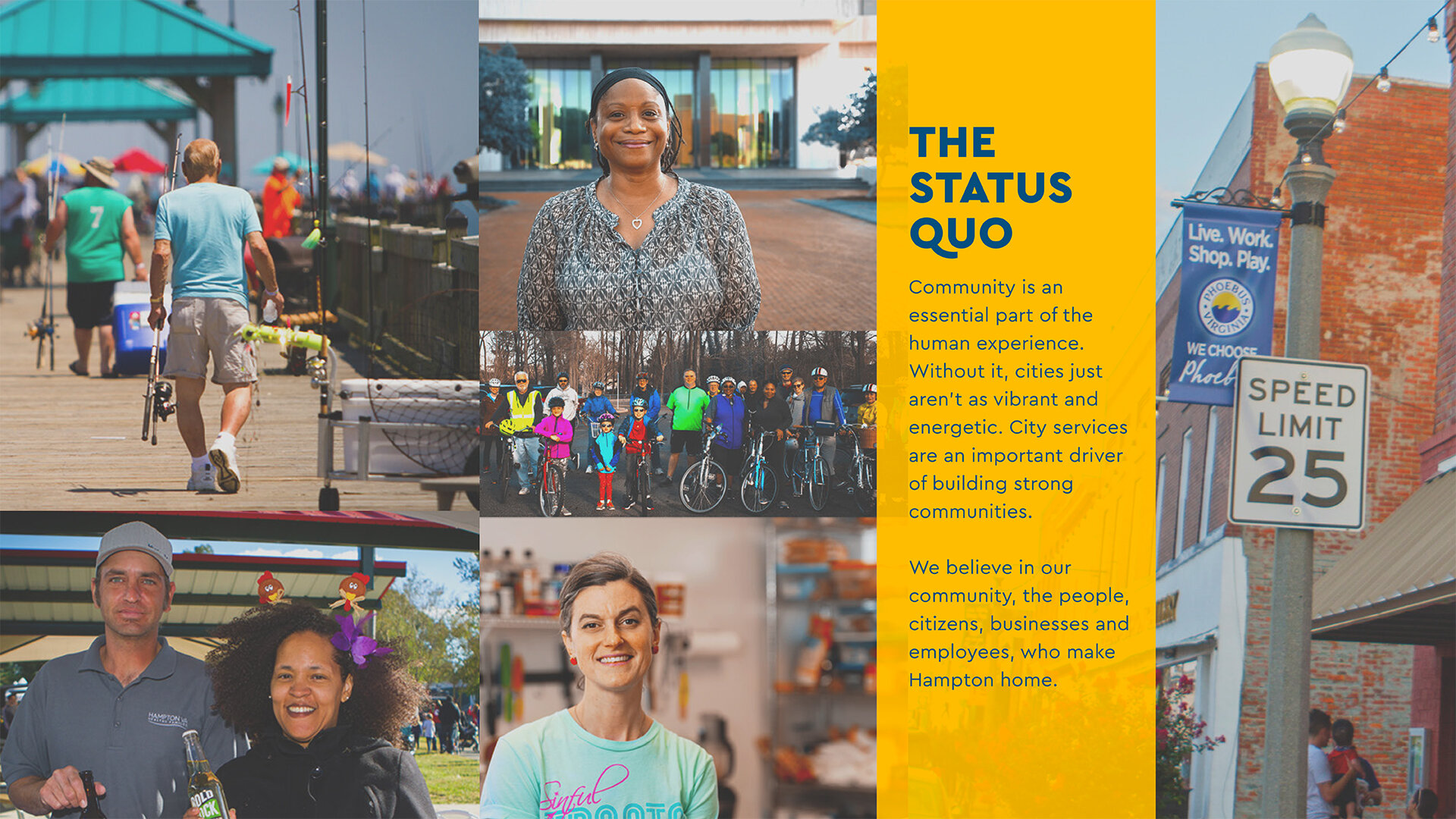
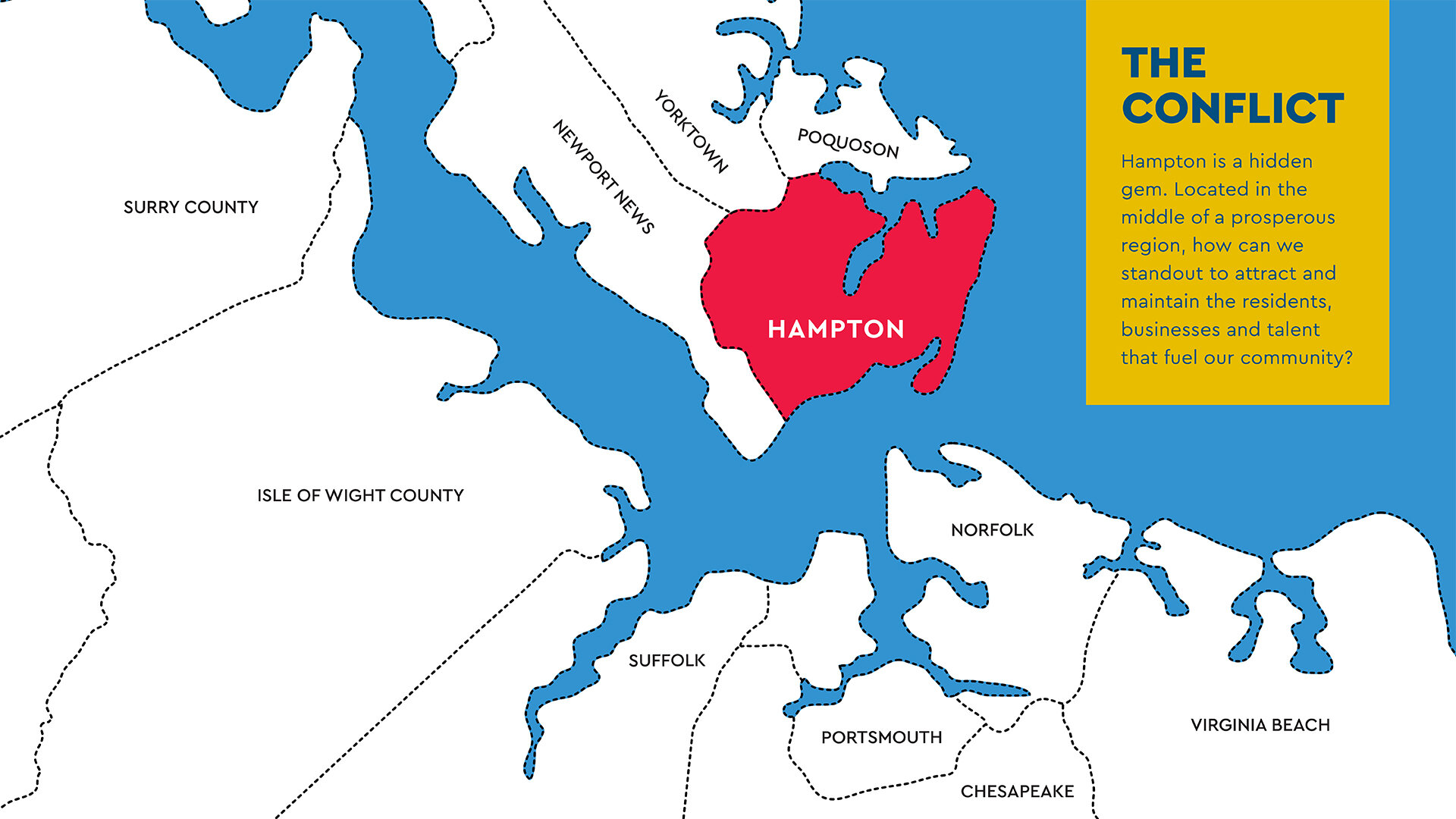
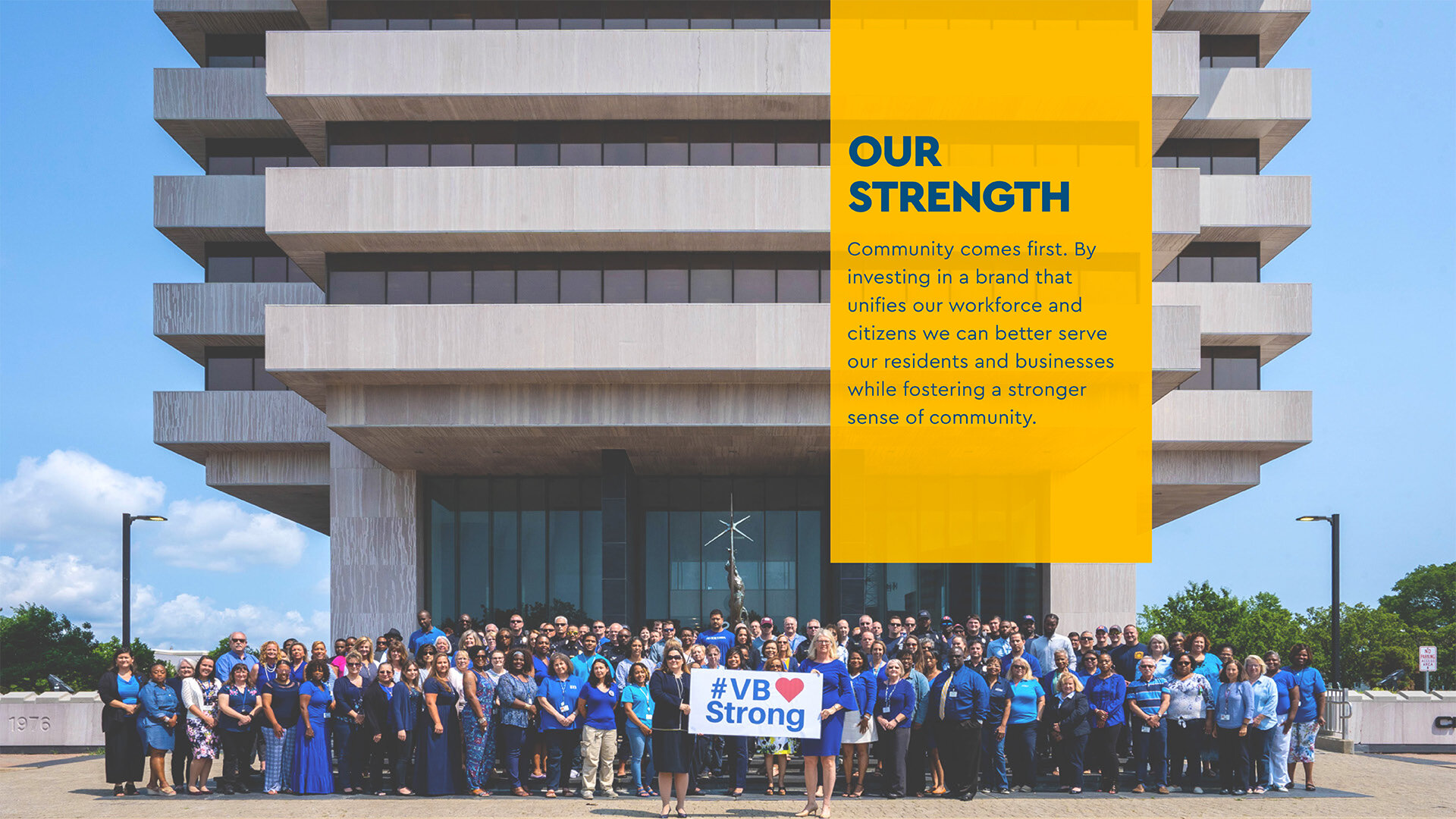
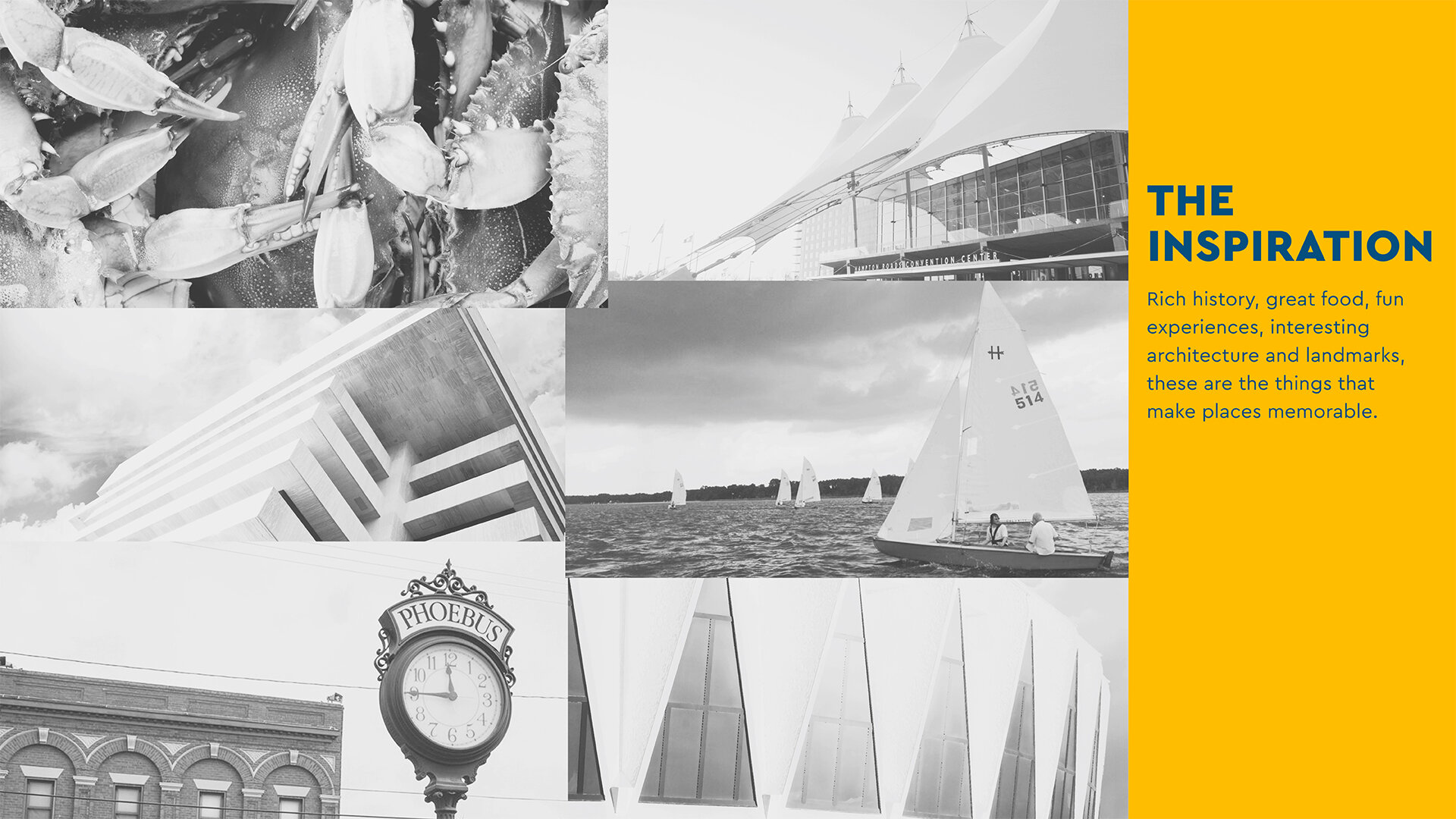
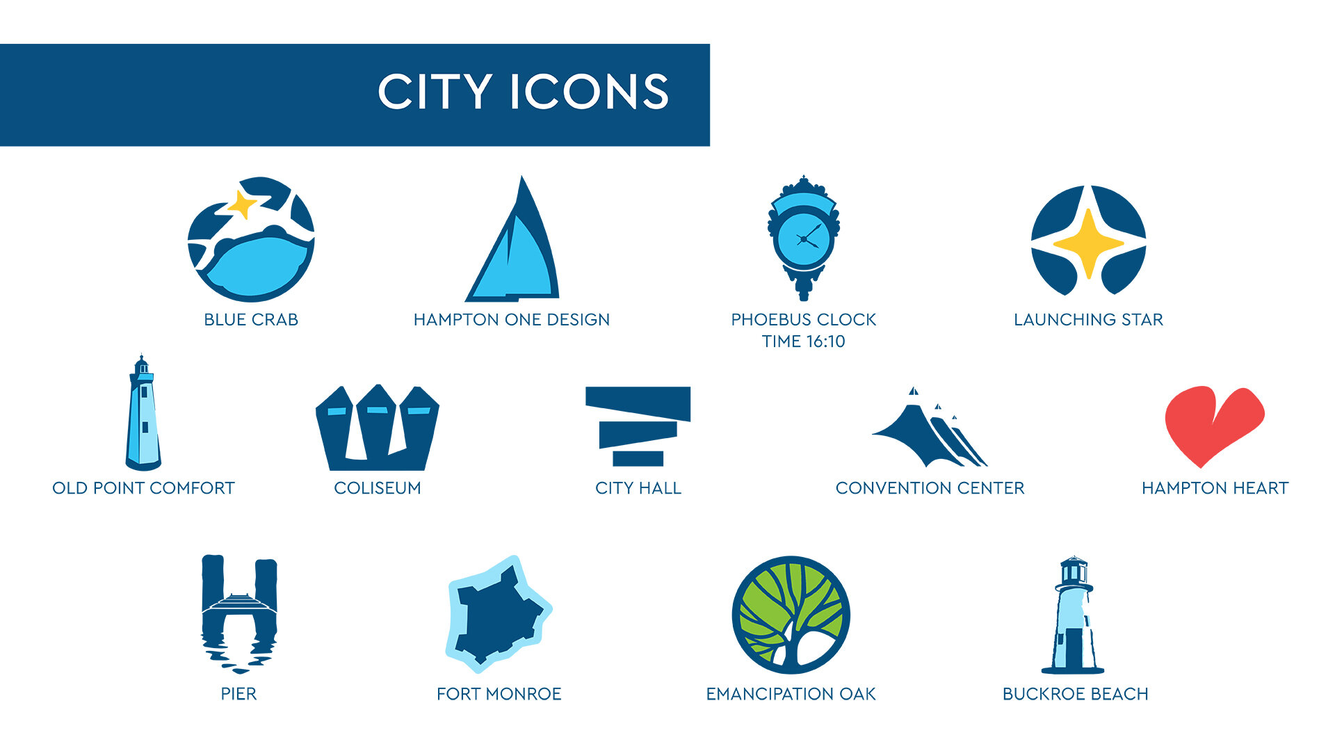
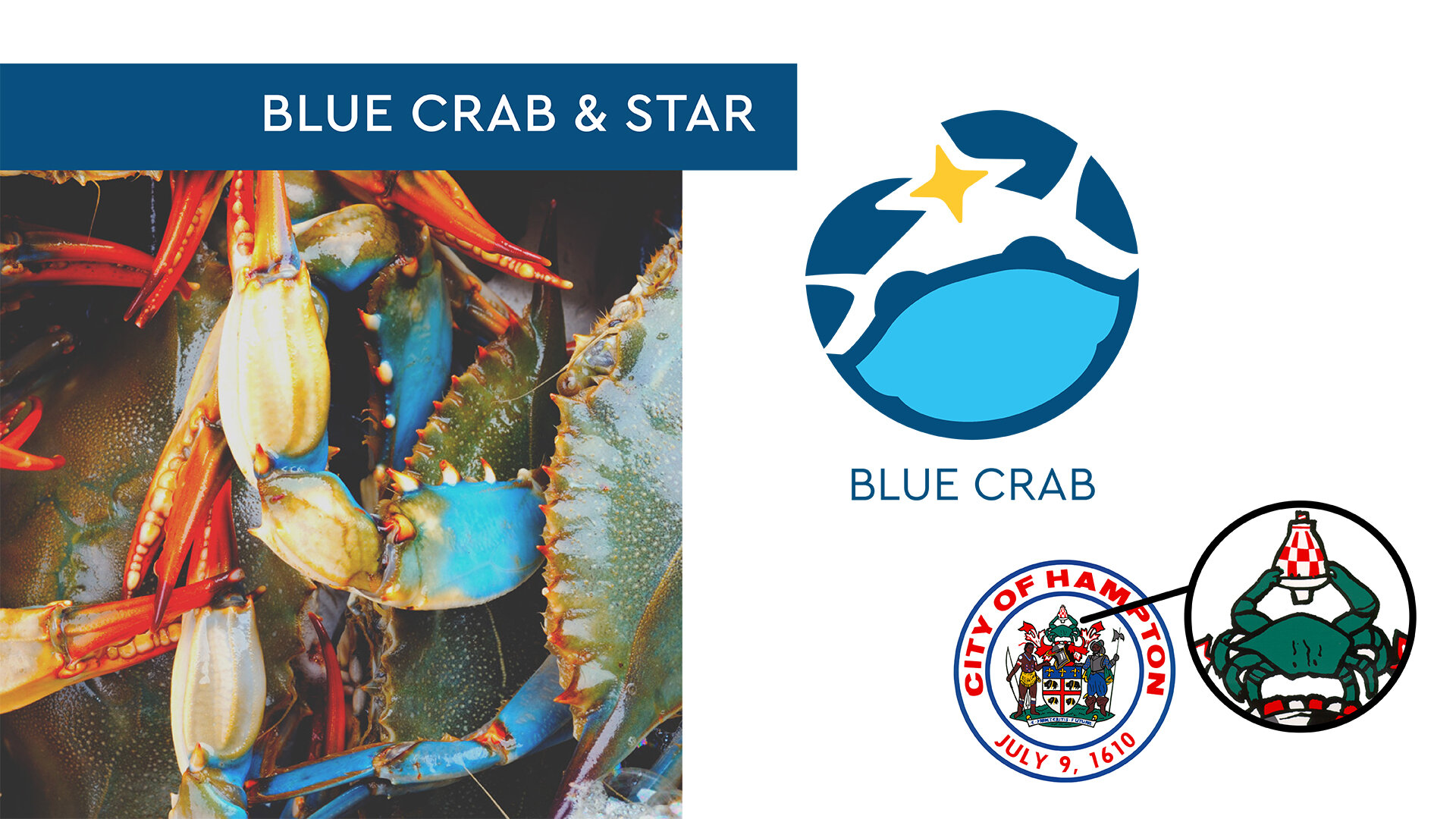
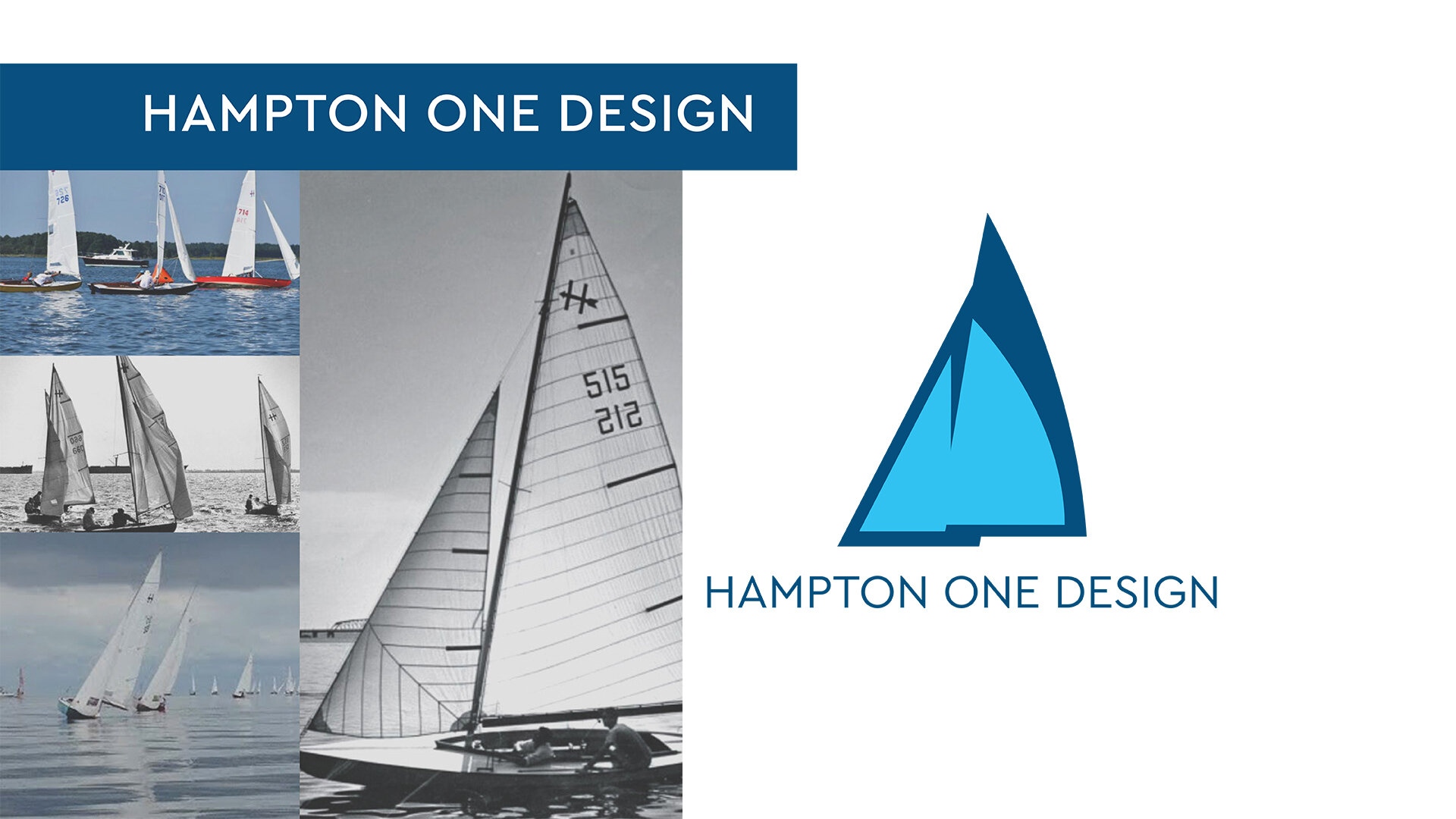
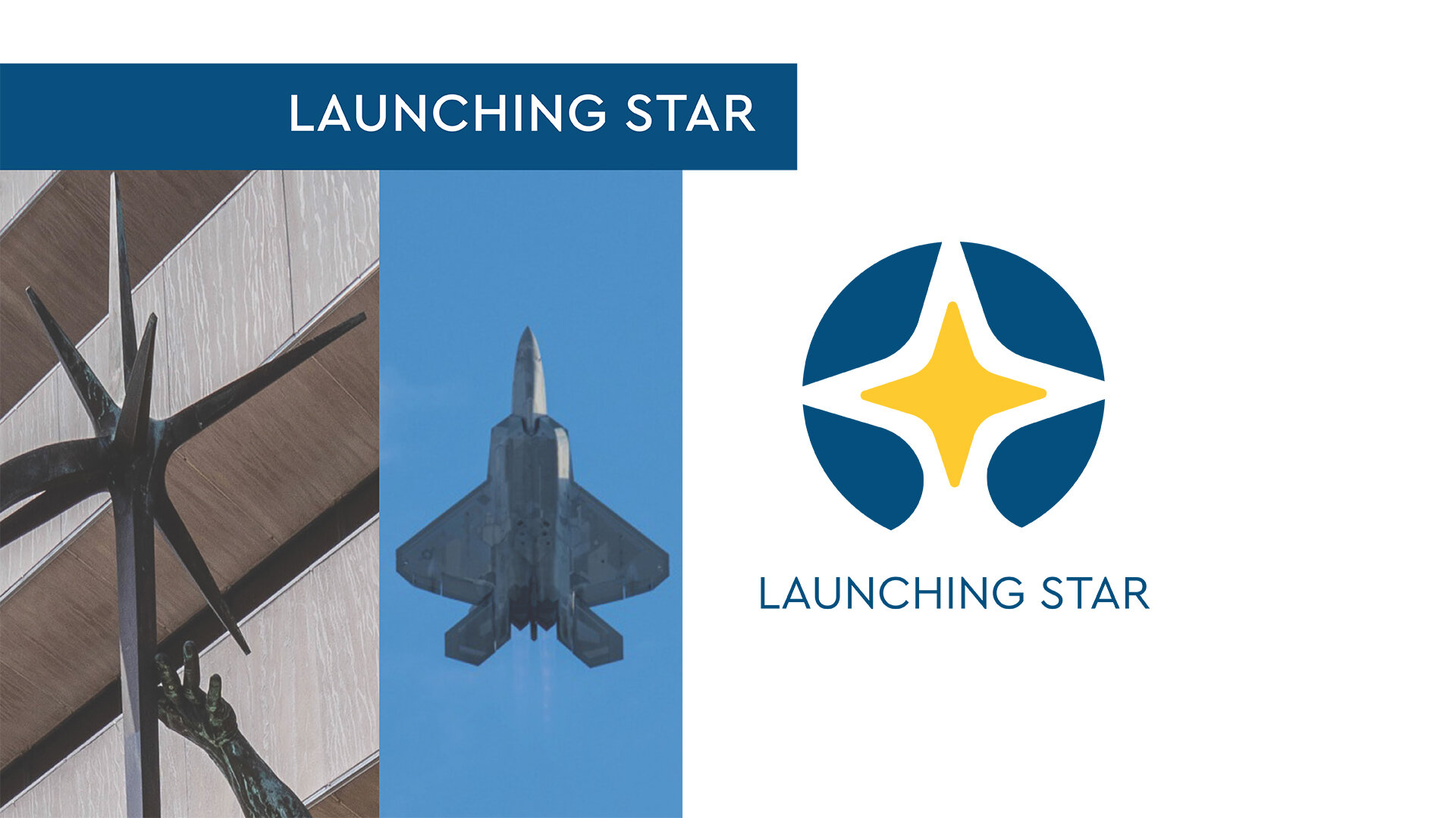
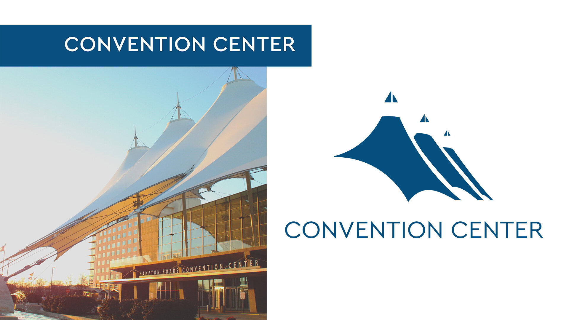
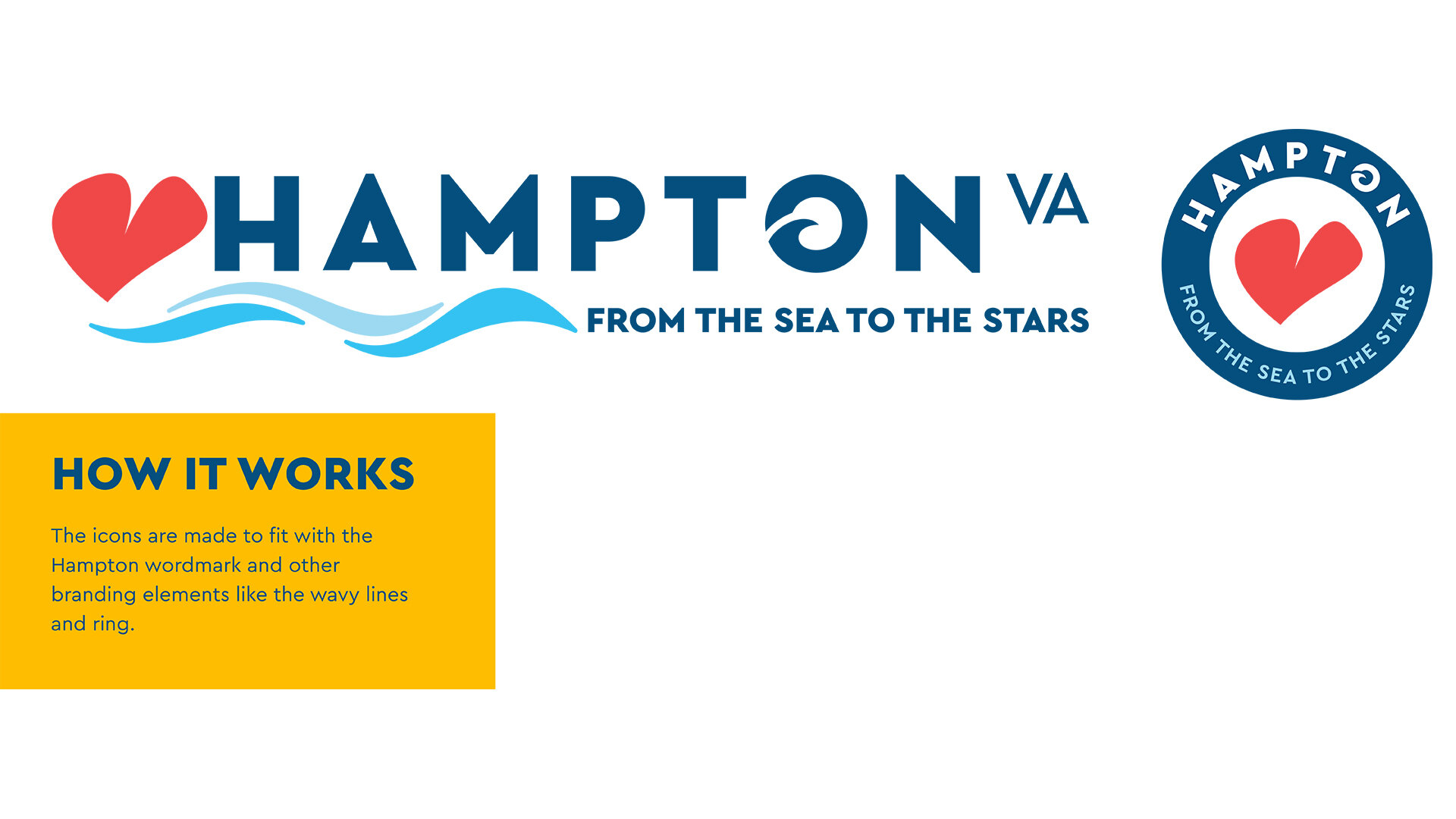
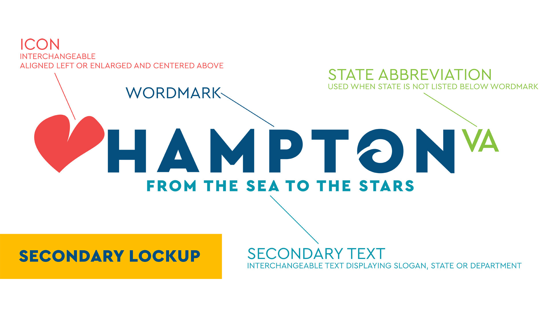
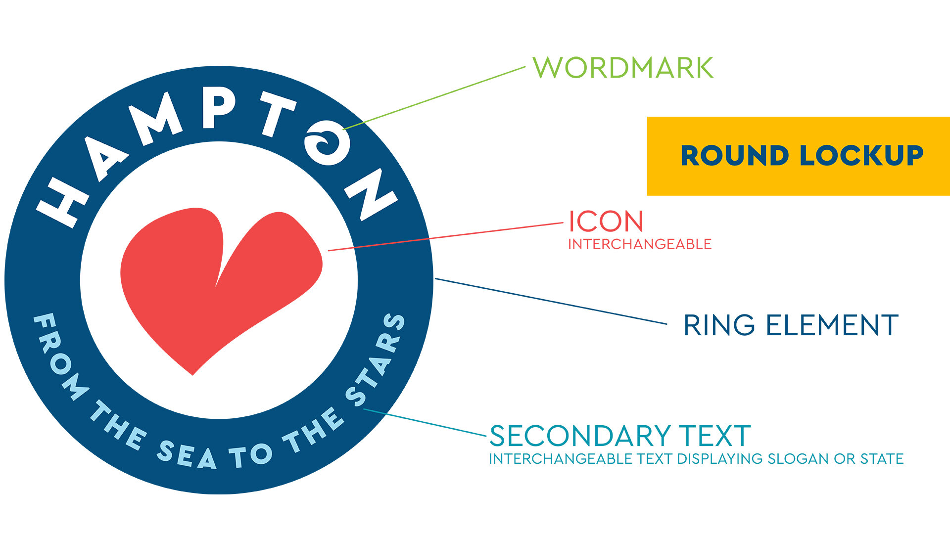
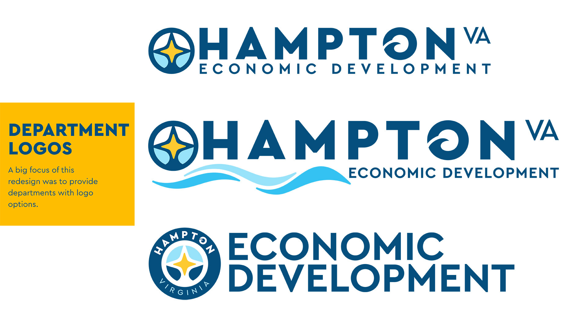
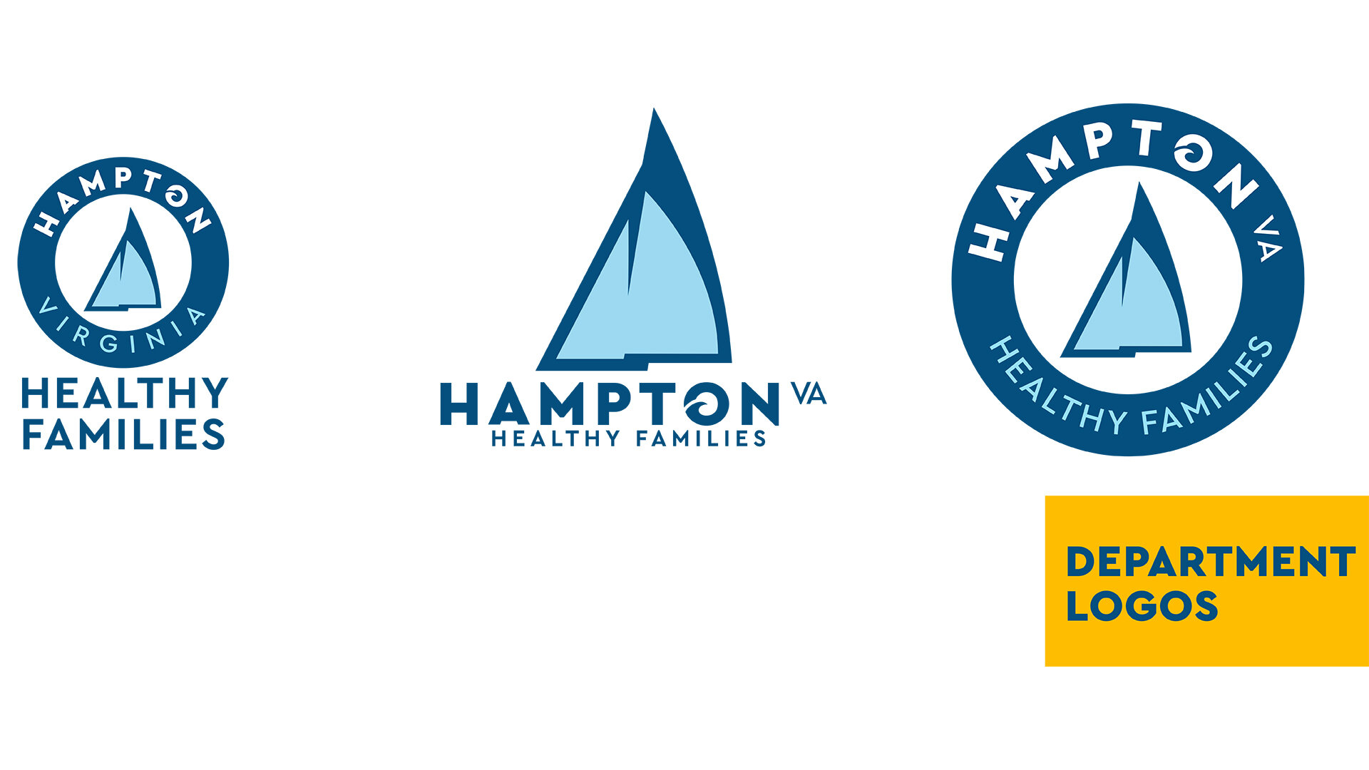
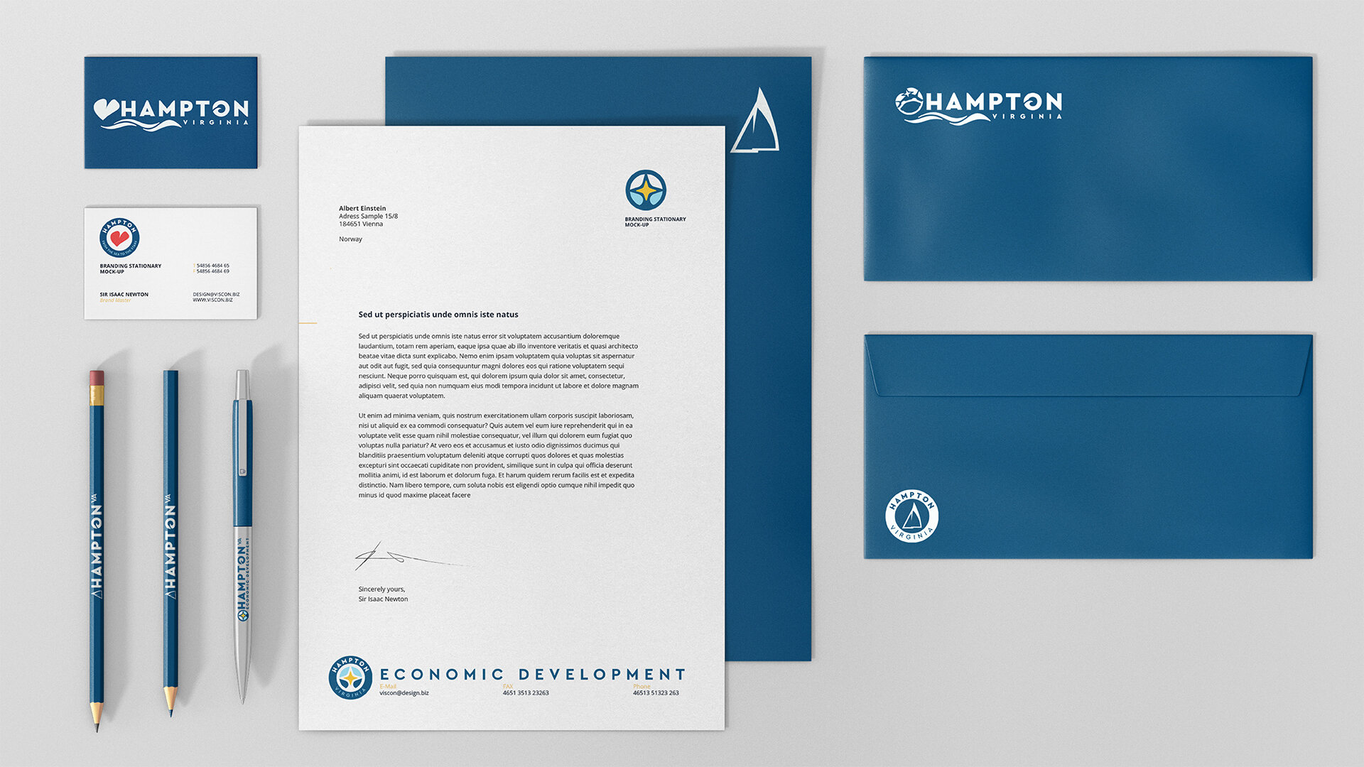
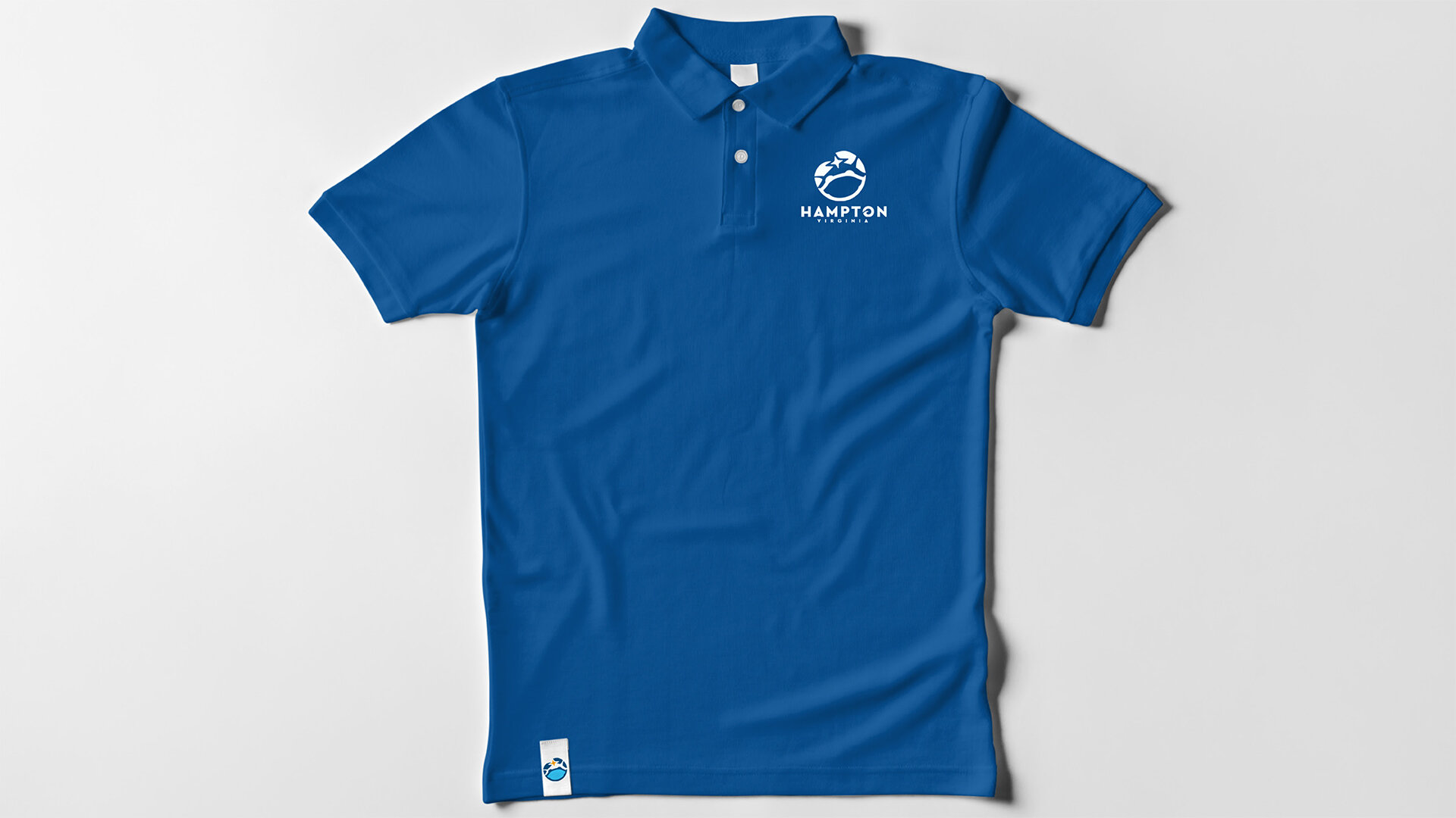
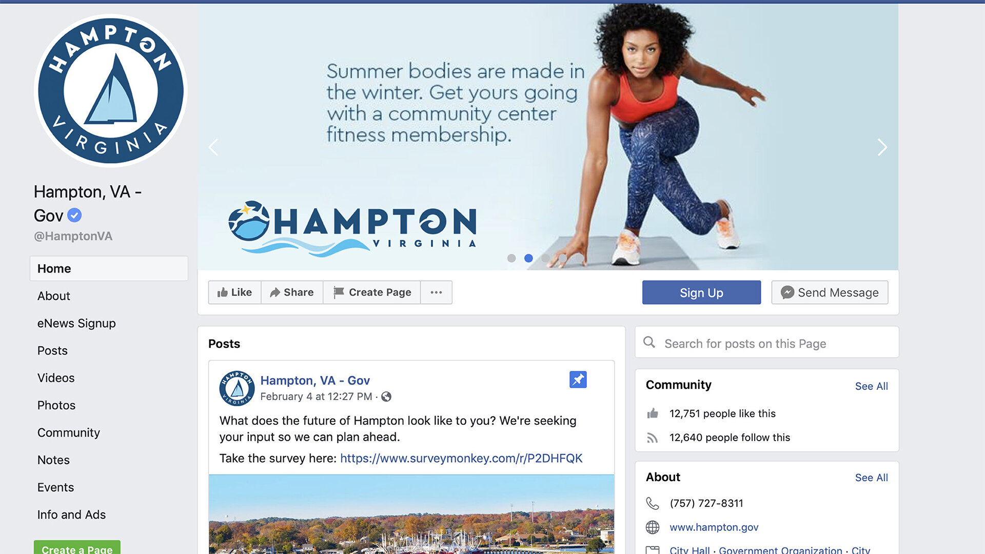
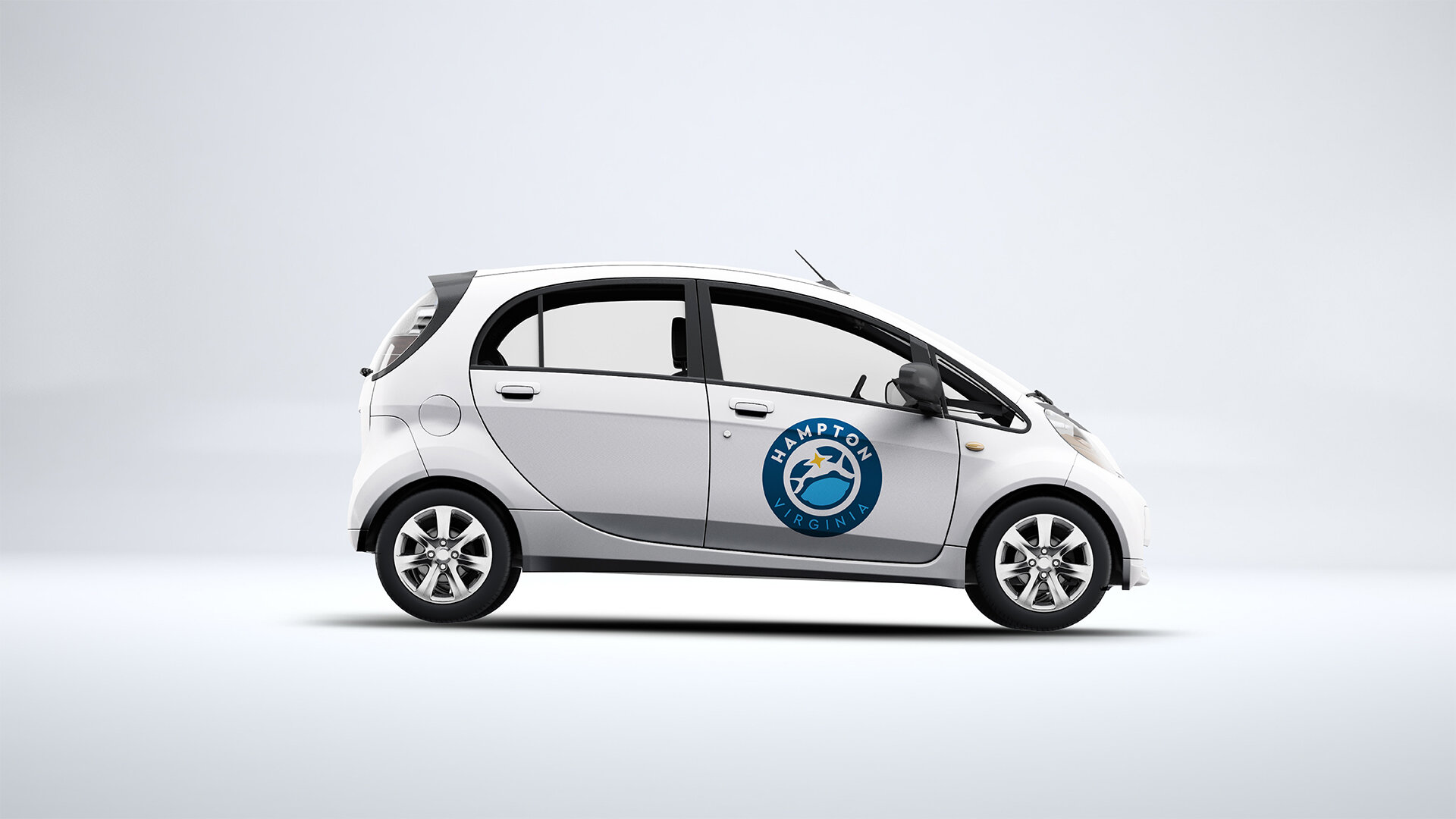
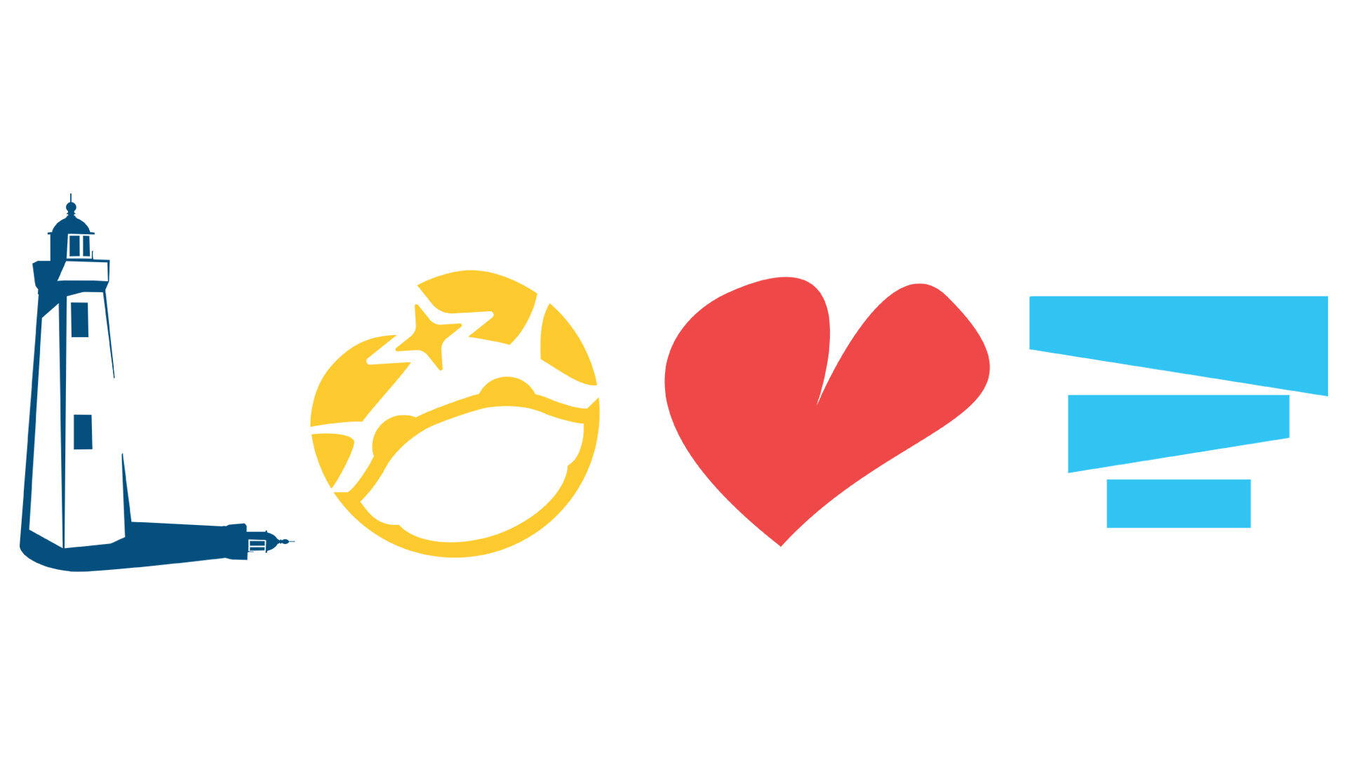
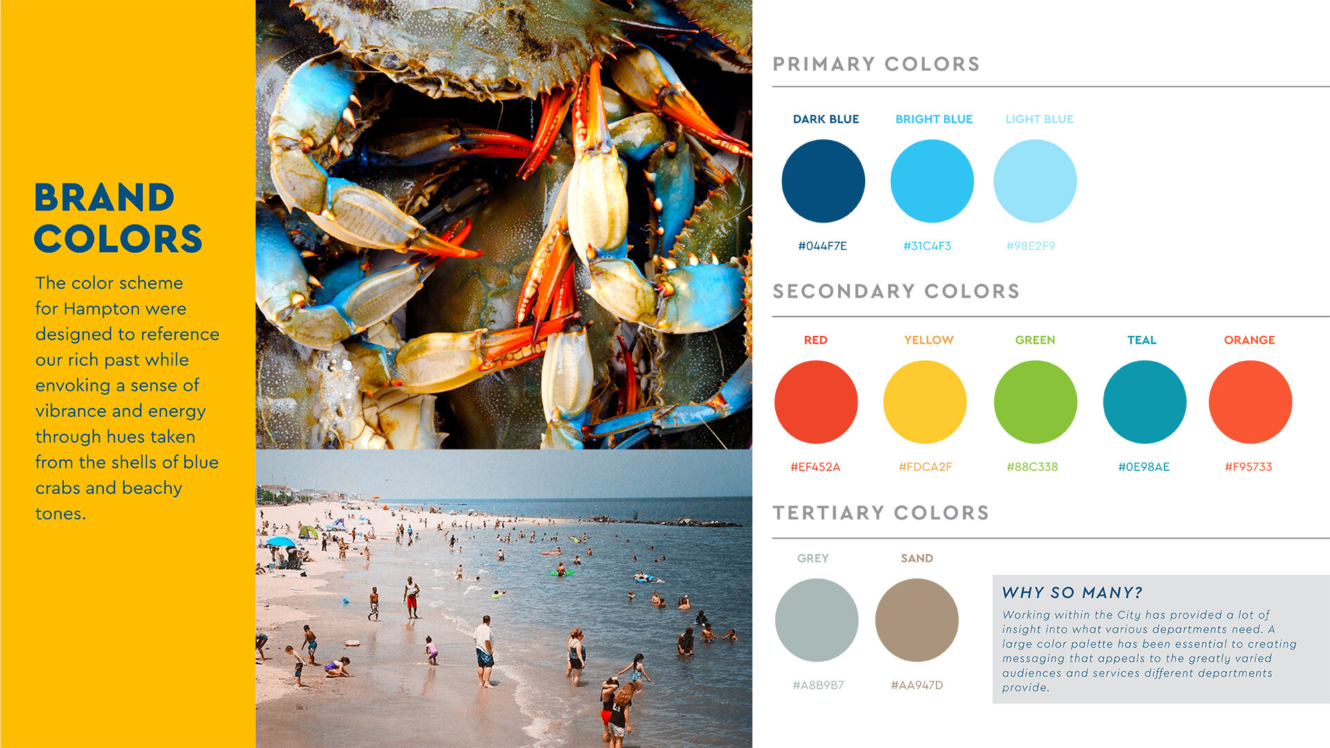
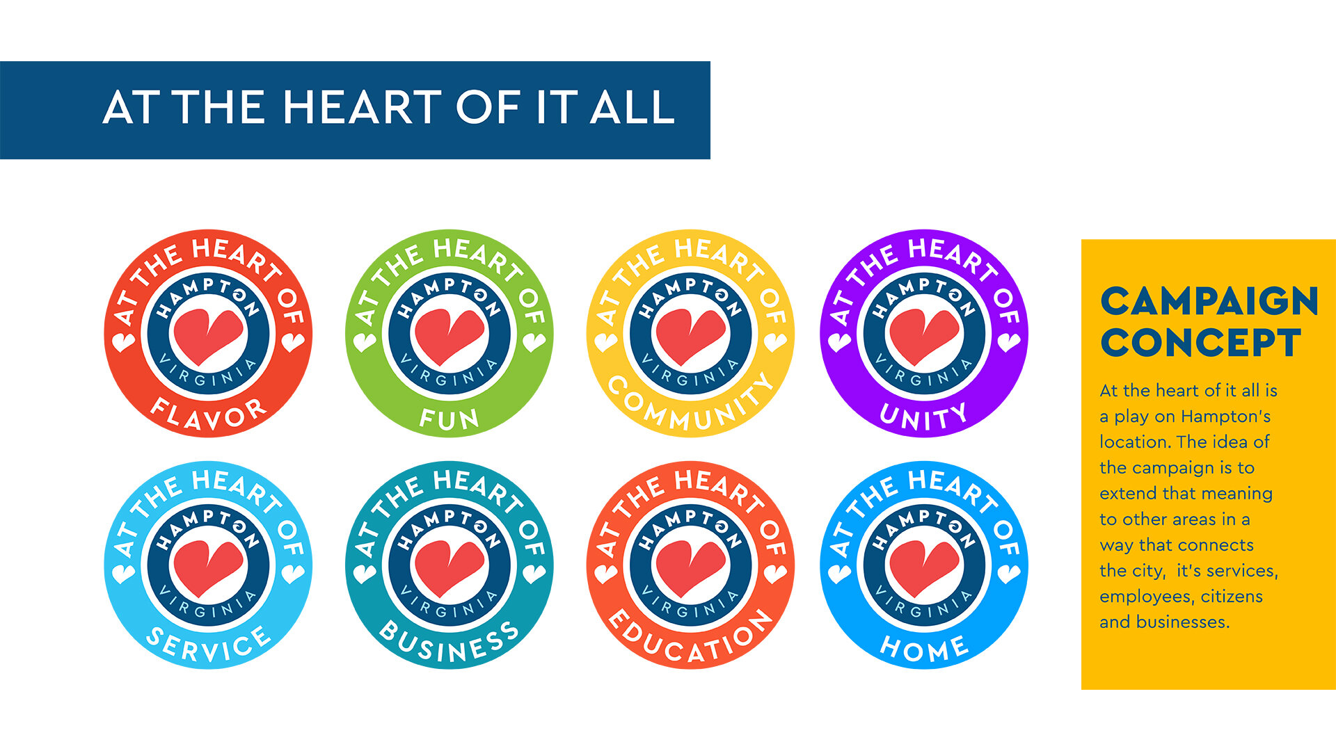
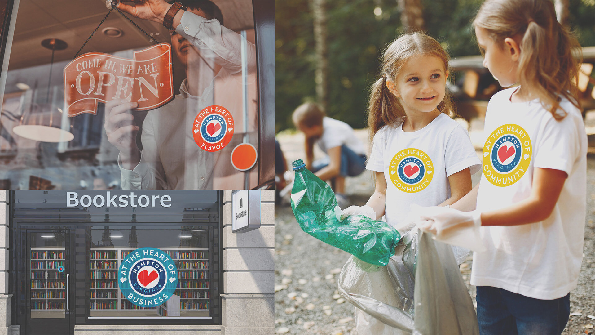
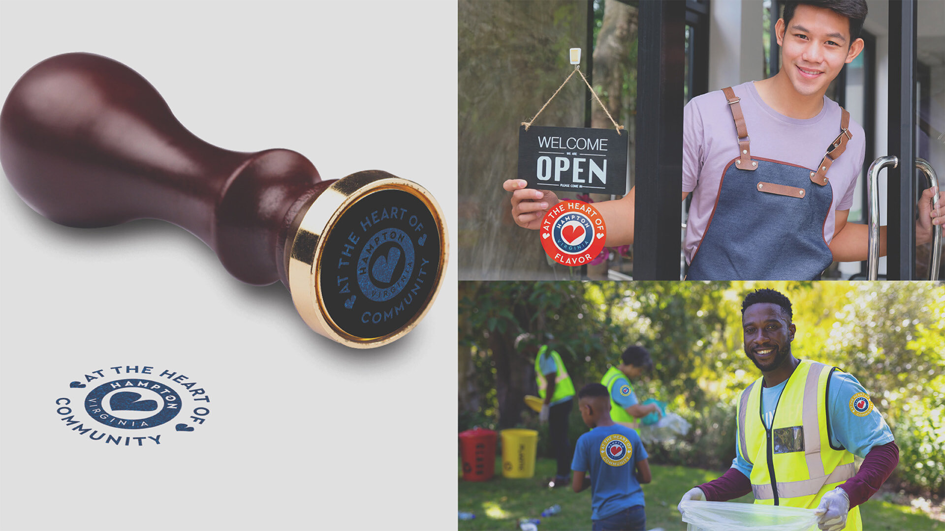
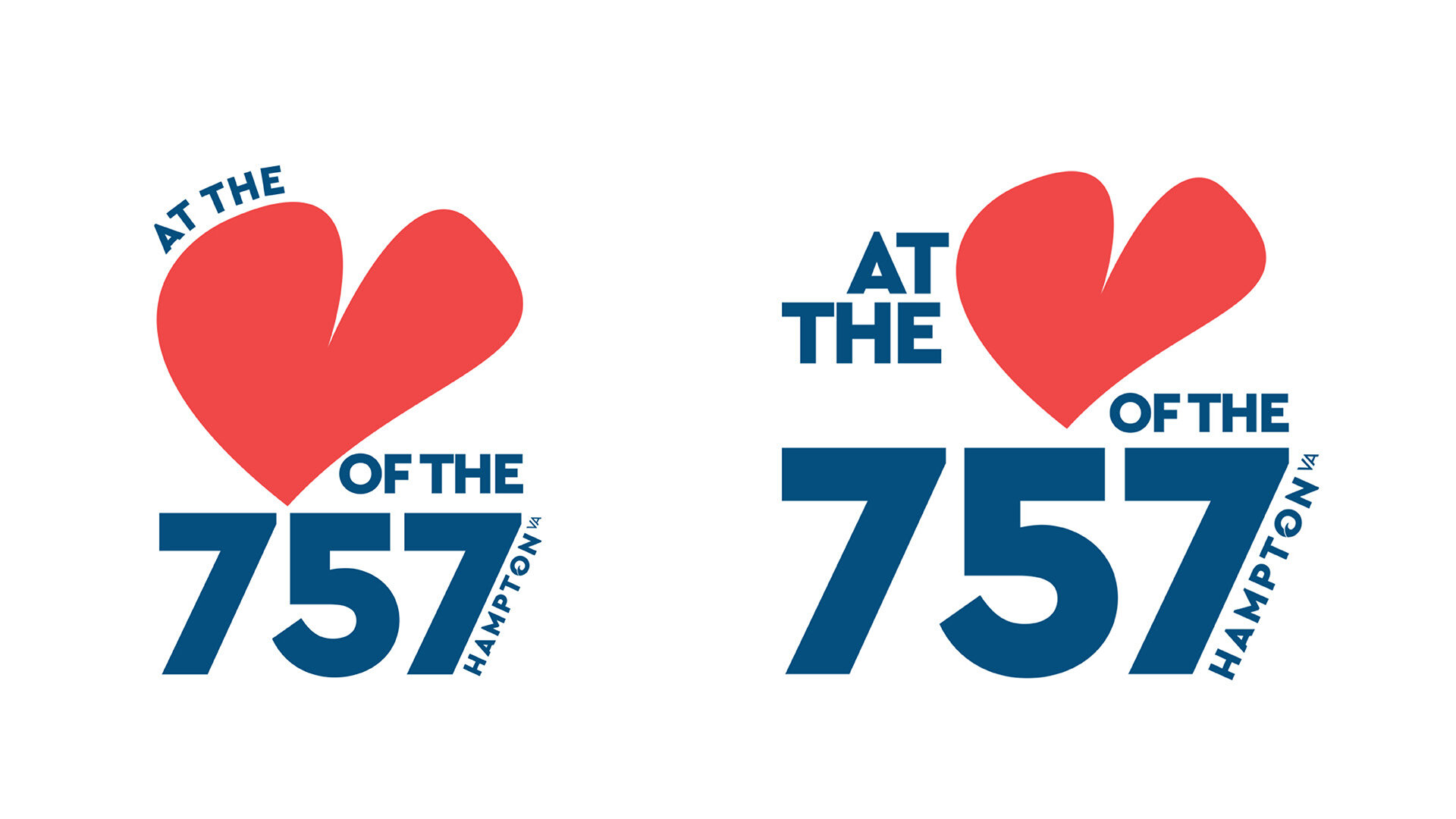
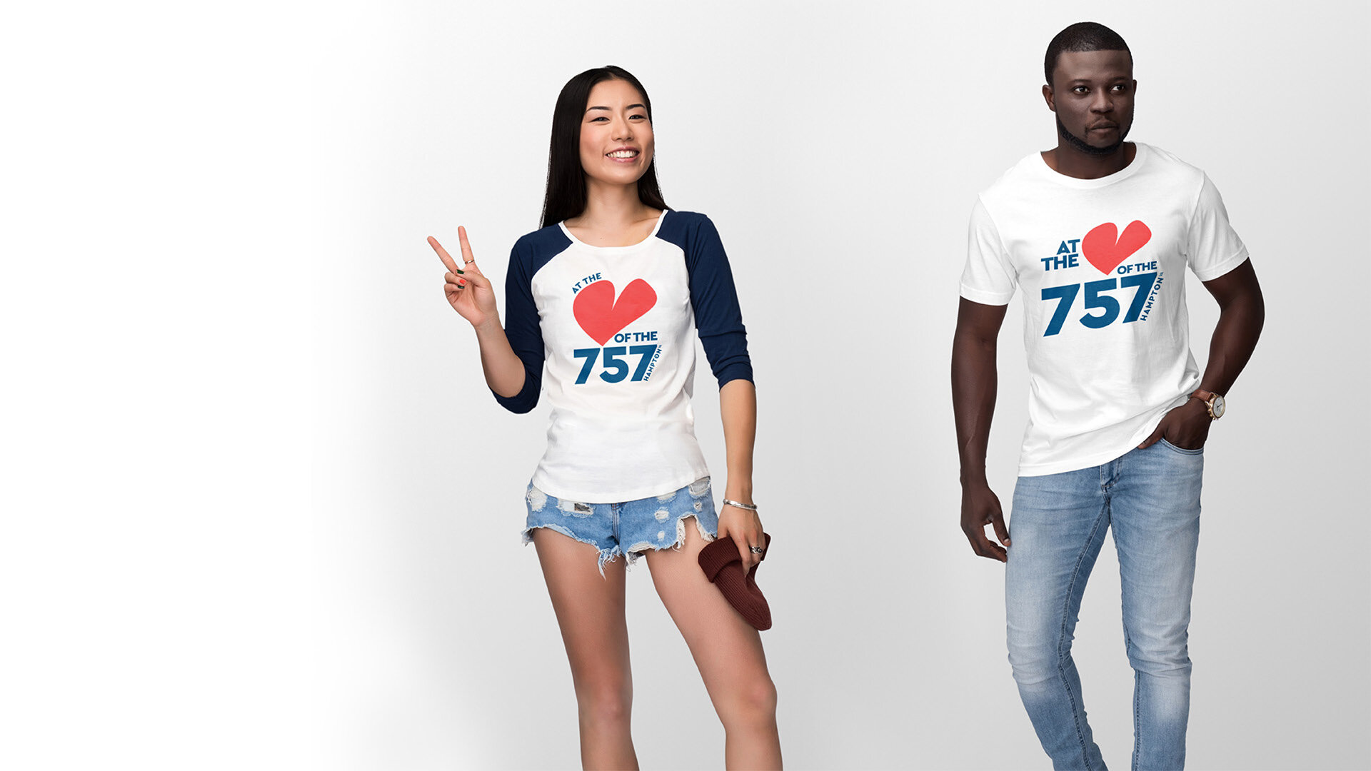
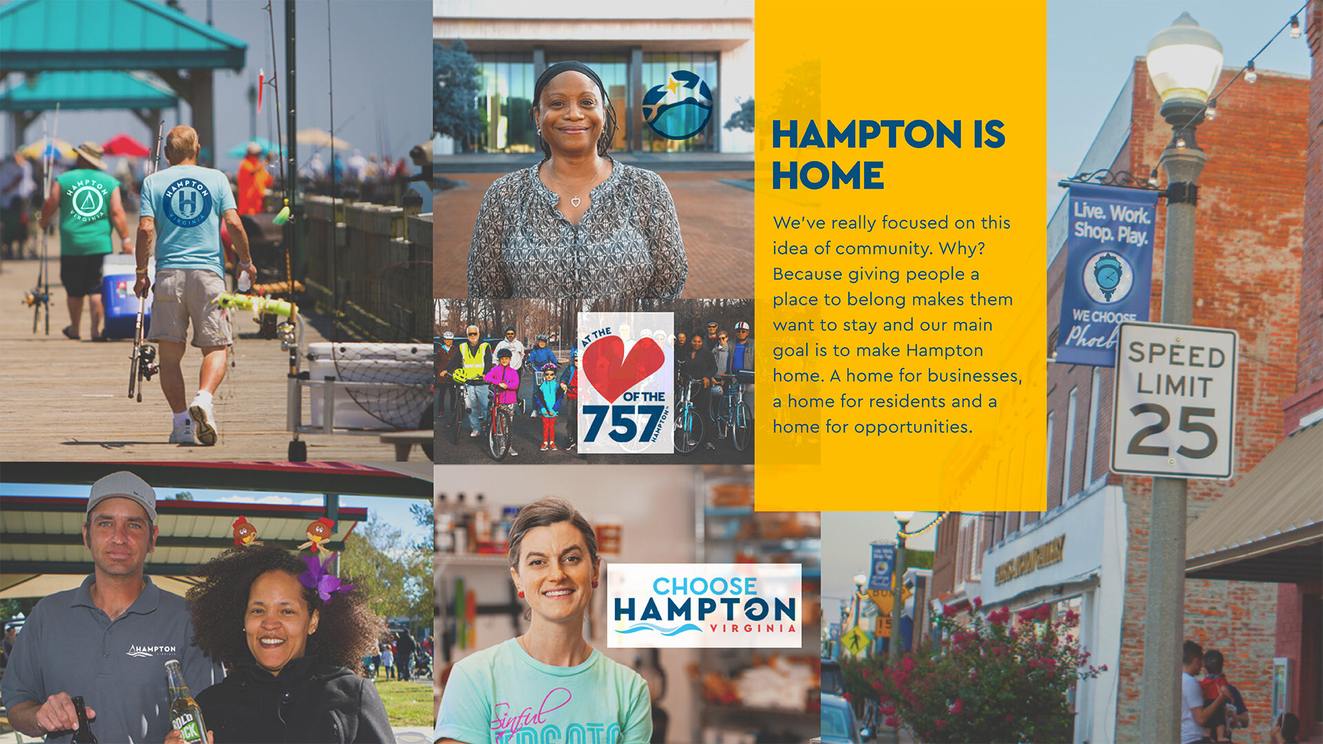
One of the reasons I was hired at the city was to help in their rebranding effort. This was one of my first projects and while I had a viable solution within a month of starting this journey, it took five years to get this brand approved. I can't say this process was easy. It was hard. Branding is something I love doing and I was determined to get this done.Initially city council wanted a crab as the logo, unfortunately they couldn’t agree and thought my designs were too modern. A logo system isn’t ideal but sometimes you have to pivot. The concept of this brand is based on insights the city’s consultant doing a brand study said, “The city almost has too many assets. Nothing rises above and beyond that we can focus on and build a logo out of.” I turned what’s usually a negative in branding reframed it as a positive.
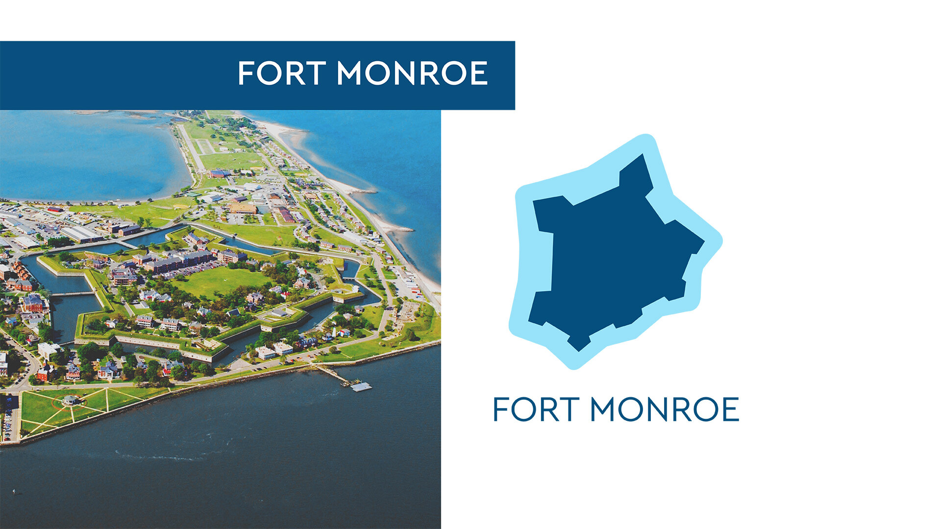
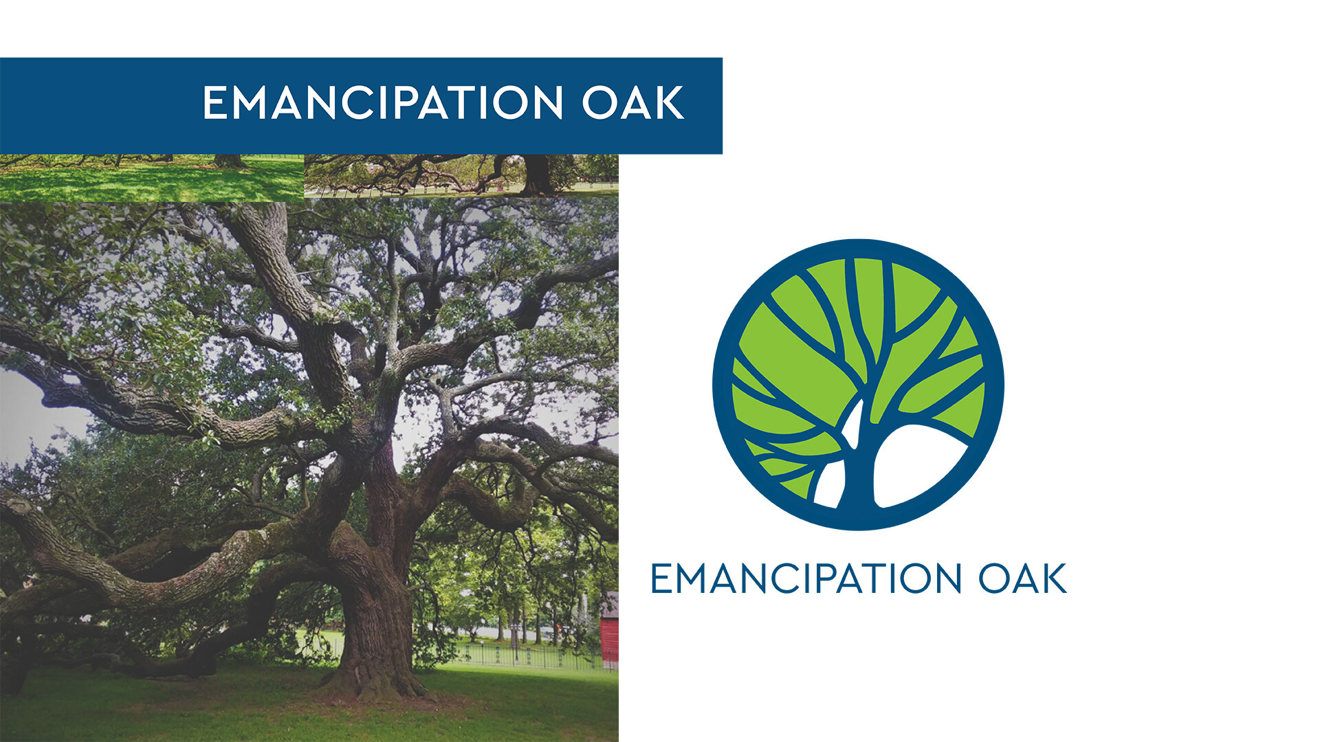
Each icon represents an important Hampton landmark, innovation or asset. They all tell a little piece of Hampton’s history and what makes it such a unique little city.
Masketeers Vaccine Campaign
This social media campaign was designed to tie into the city’s mask-up promotion. Above is an animation using the same photos I used for the Instagram stories images.

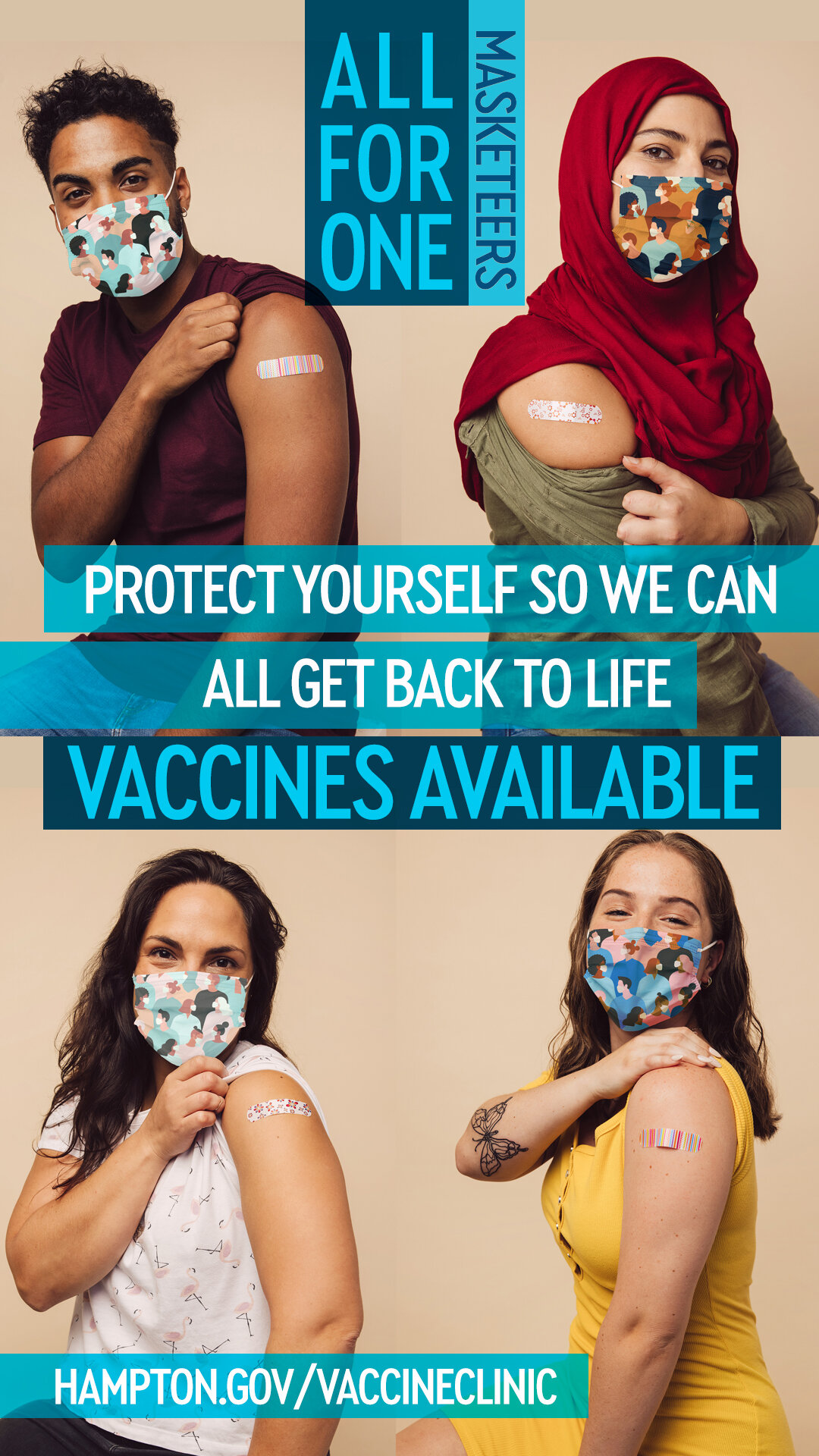


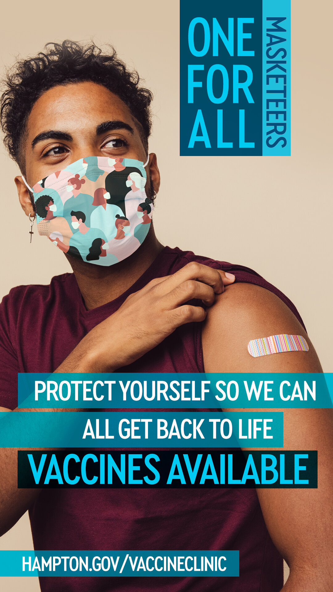
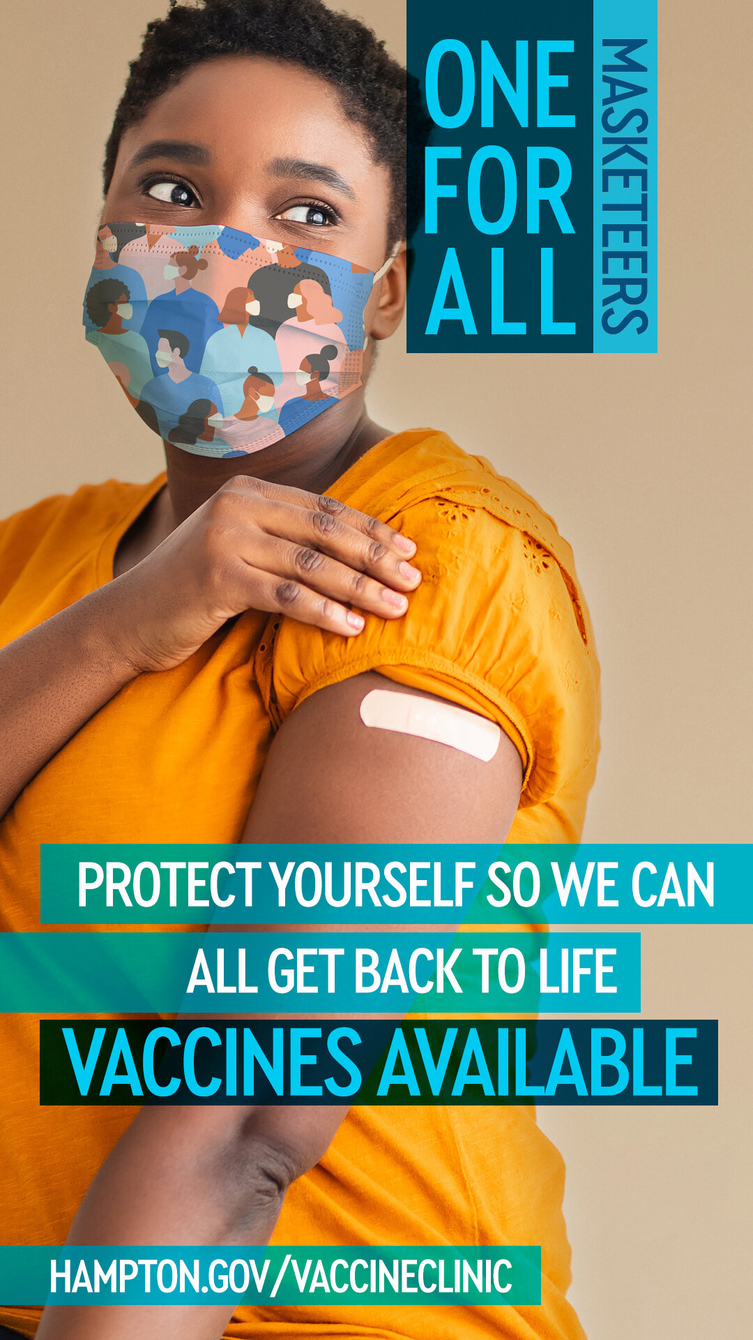

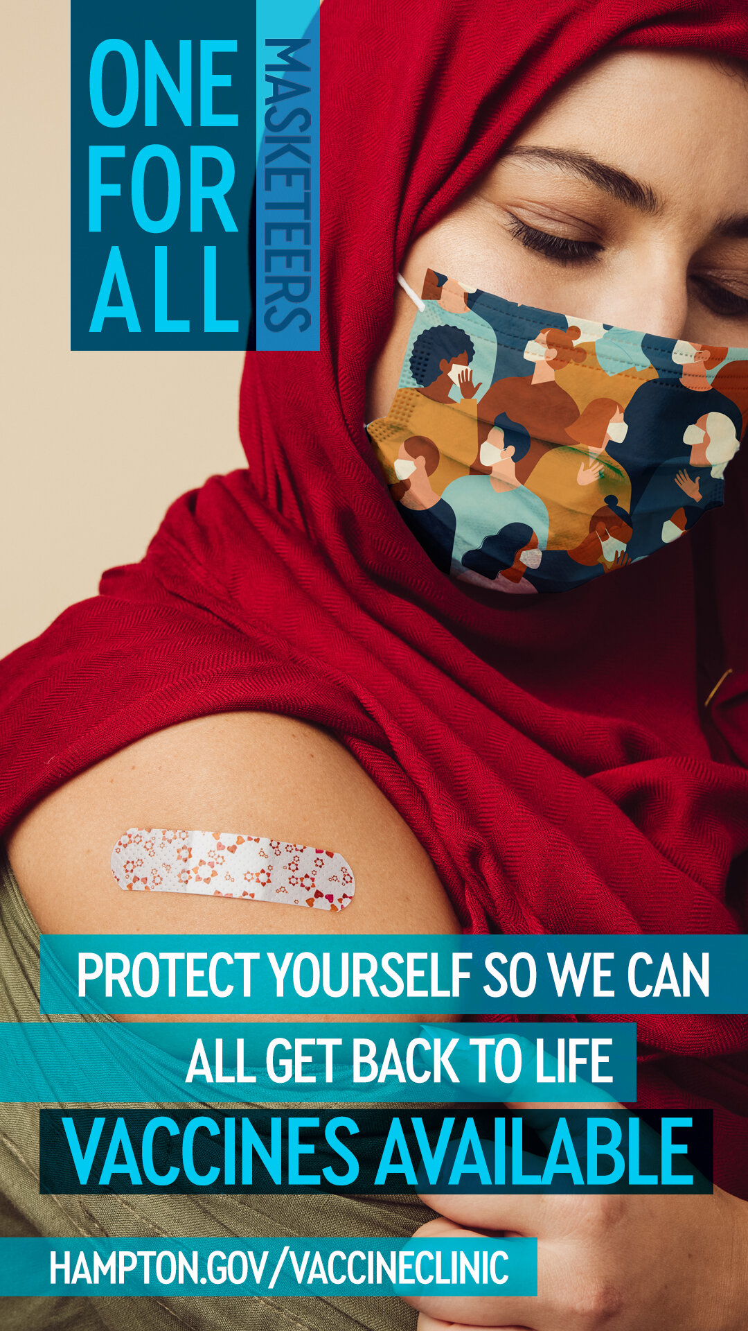
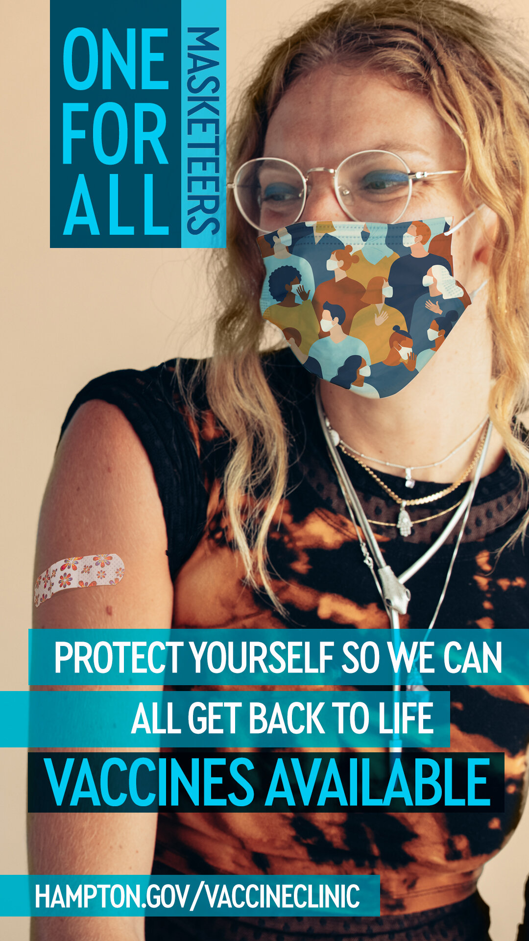


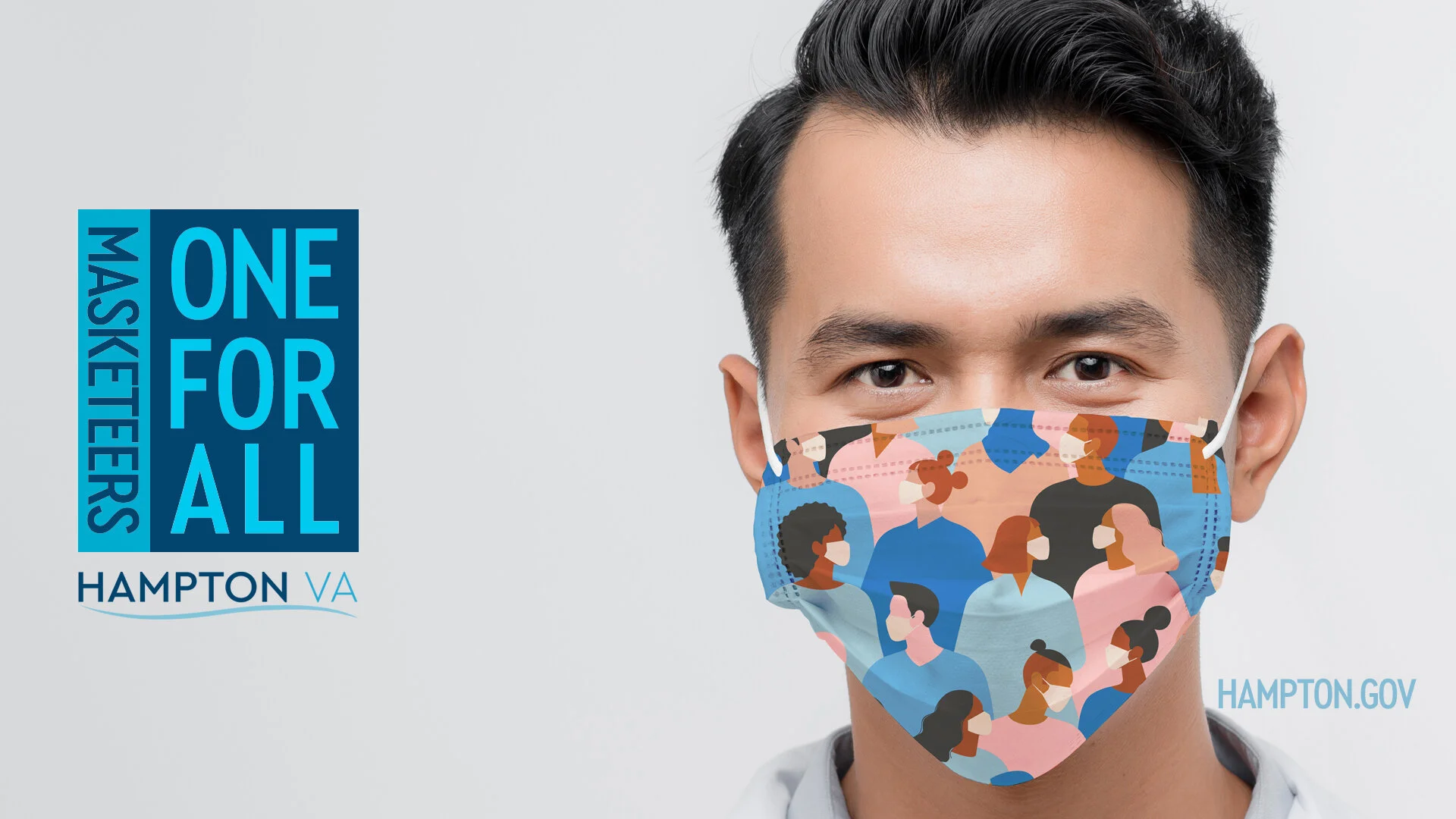


Masketeers Campaign
As COVID-19 cases among kids, teens and young adults were on the rise, I was tasked to create a campaign to encourage to wear a mask. While I was developing a concept to build the campaign around, my thought process kept circling back to the fact that masks don't protect the wearer as much as it protects others. The idea of framing the messaging around the Musketeers motto of "One for All, All for One" seemed to fit perfectly. 


Hampton Bike Walk.
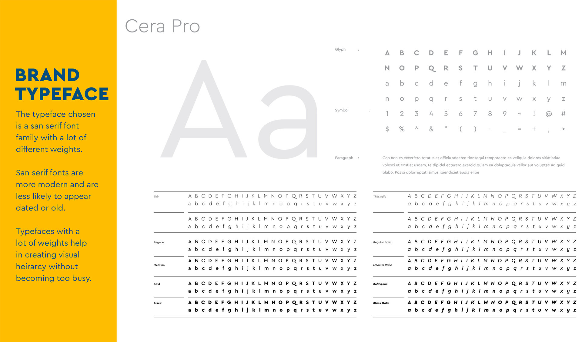
I created this logo for the launch of Hampton's bike and pedestrian plan. It consists of a front-facing line icon of a bike that doubles as shoelaces. The outer track created the shape of a shoe while the toe of the shoe also become the horizon the bike figure stands on. The bike icon is also reminiscent of a person. The color scheme relates back to the website and the typeface, Cera Pro, is used for the majority of branding, marketing and outreach purposes. 




Hampton Animal Response Team
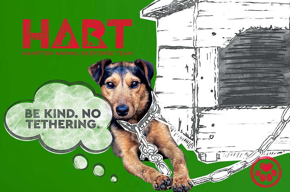
Hampton animal control decided to rebrand toward a less officer of the law look and feel to a more friendly, caring concept. This project went back and forth quite a few times. The biggest issue with this project and most I come across is the expectation that a logo will do everything for you. There were too many ideas and not enough understanding of how a logo is just one aspect of a much larger system. I had to start over twice to find something that worked as a logo while expressing who they are as a department. I took their new name, HART, all their ideas and boiled it down to the slightly imperfect heart in a paw print image. Along with the new branding, they requested mock-ups of work shirts and a truck wrap. Along with a few t-shirt designs for promotion, I created some marketing to help sell the concept and show how this brand would translate into marketing, or how the logo fits into the bigger picture. I created images that related to their current marketing pieces to show how they would be transformed not just in print and how they could be carried over in social media.






Hampton Calendar
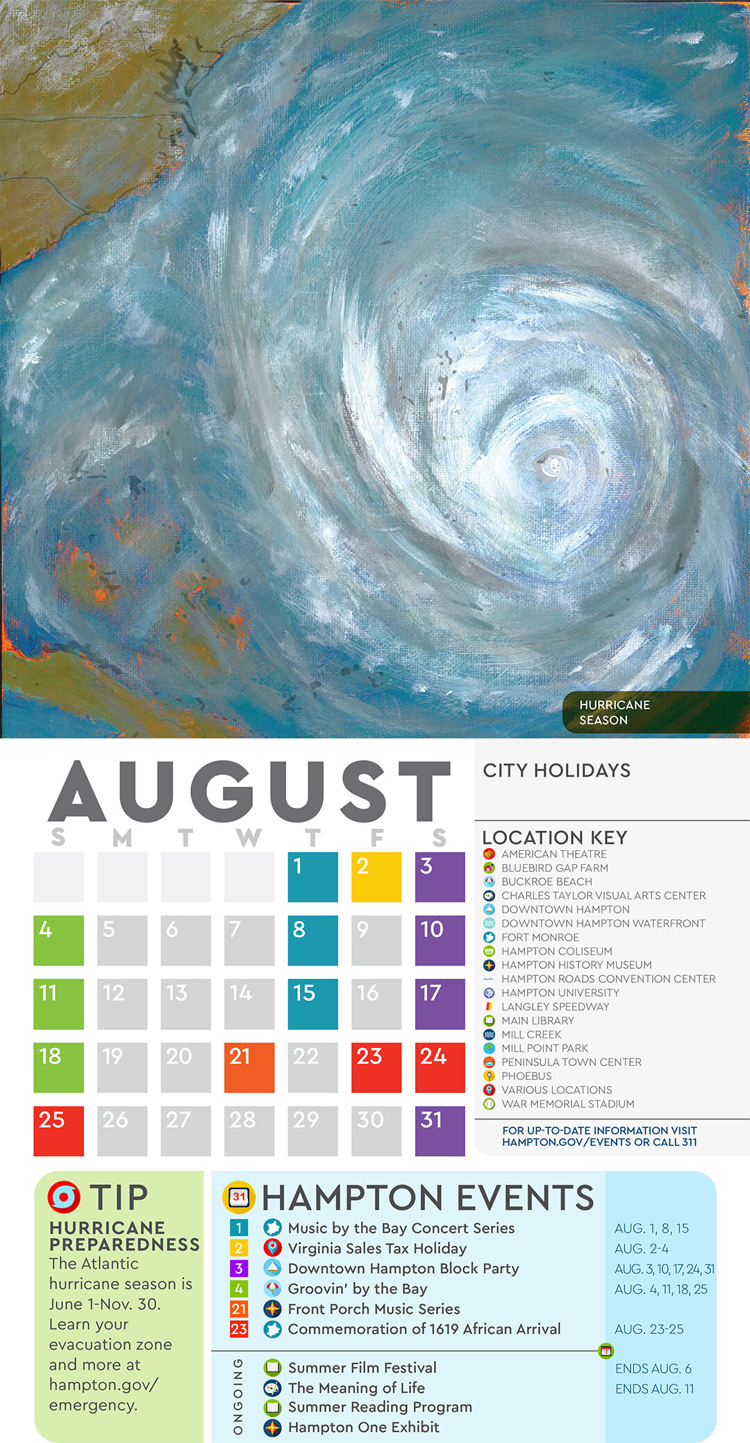
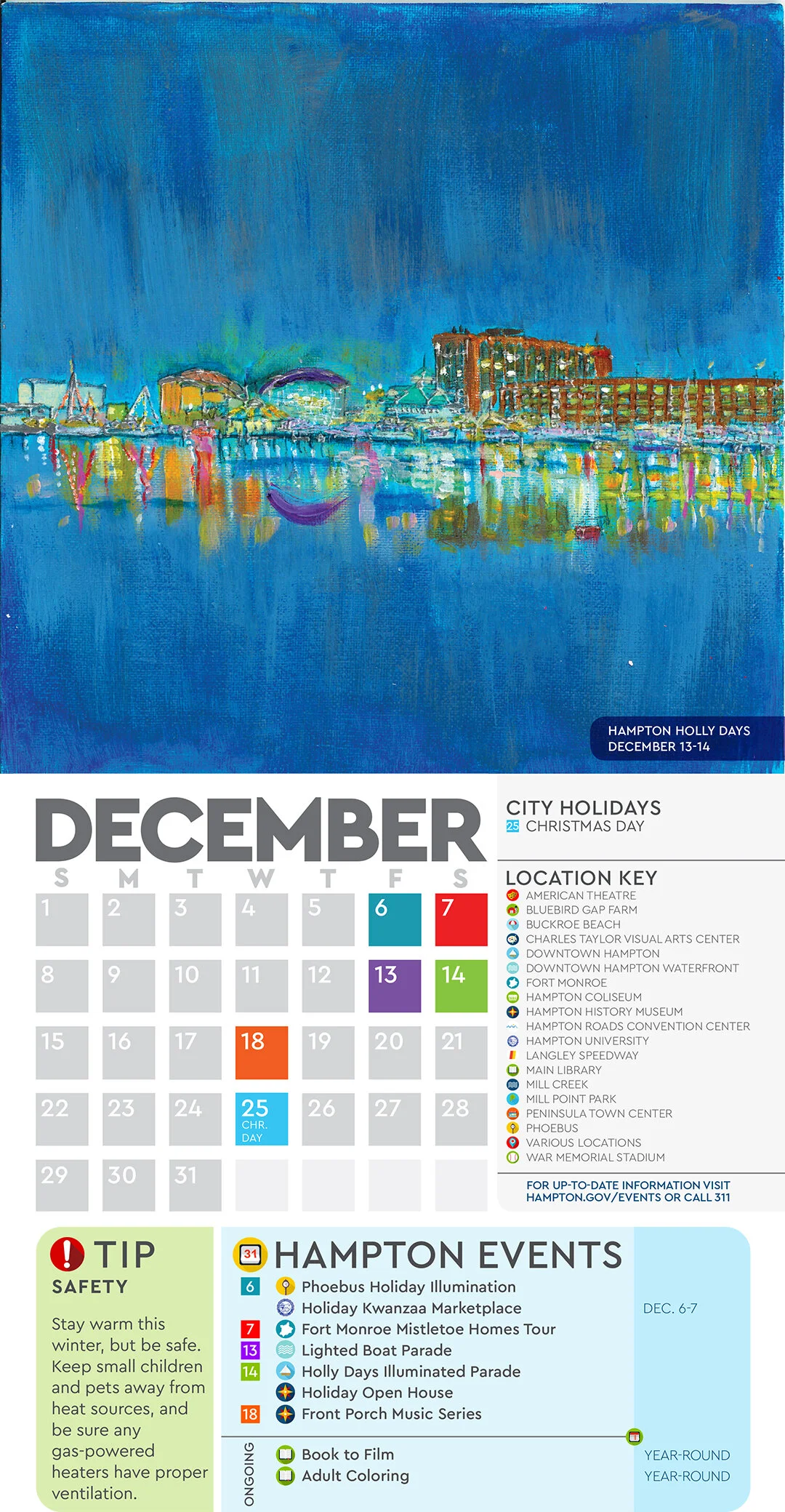
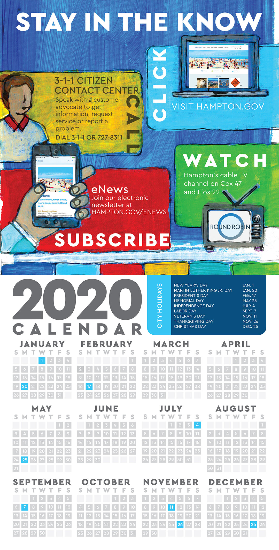
Every few years the city's public works department mails out a trash schedule with useful tips for residents. I believe that the best design marries form and function and that the public works calendar could be one aspect of a much more useful marketing piece. Unfortunately my idea was shot down, but patience and persistence paid off. It over a year before I was given the green light to proceed. Public works didn't opt in to this new format, in 2019 so we included general tips and local events. The calendar isn't too big at 8"x16" unfolded and I knew for this project to be successful I needed compelling imagery that people would want to look at but the city doesn't have a large catalogue of high quality photos. My crazy solution was to paint all the calendar artwork using images I could find while creating a consistent look. The concept of the artwork was to combine a Rockwellian meets Hopper view of the city, each piece depicts a scene from a city run program, event, landmark, location, business or historical figure. In the end the calendar was a huge hit. Sadly there will be no 2021 calendar due to the uncertainty of holding public events during a pandemic. 

2016 Website Redesign.
This was one of the first big projects I was assigned. Without a full fledged brand to work with, the choices I made here were in part to create a touchstone for brand elements like color and graphics for other marketing materials to relate back too.The city uses a third party content management system to handle the complexities and compliance issues that arise from government requirements. I used existing sites created by our contractor to create the layout. My goal was to project and open feeling, easy to navigate website. The colors I used were a mix of the brands established blues, a more true yellow than what was in use and the addition red and green. My goal in expanding the colors was to promote a sense of vibrancy and energy while providing more options for departments.


2018 Website Redesign.
Going through the same process of taking various sites our CMS provider has done, I created the current layout we have now. In addition to creating the layout I also created all the graphics used on the site, except most newsflash images.

